UNEE is a learning management software that helps university students manage their academic activities in one place.
The problem
Students face challenges managing their academic lives, leading to stress and disorganization. The existing student app had issues with design, user experience, and app flow, making it ineffective.
The solution
An intuitive platform redesigned for simplicity, organization, and usability, enabling students to manage their academic lives more effectively.
Tools
Figma
Role
Lead Product Designer
The Process
Building on pre-existing research, I carried out further studies to gain deeper insights into the intended overall user experience with the product and user needs and pain points, which helped refine the features to include and the product roadmap.
Based on findings from the previous version and user interviews, I explored design solutions that balanced business and user needs, creating low fidelity wireframes and testing with users. Before finalizing the design, I conducted another round of usability testing to ensure its overall effectiveness and value.
Research
The previous app had quite a number of useful features which could not be accessed to their full capacity due to the infrastructure required to implement them and budget constraints, such as the announcement feature and inter app sharing and communication through different app users, to name a few.
Testing the existing app, these are some of the pain points identified that users went through
Navigation
Users had issues navigating the app
User flow
Break in the user flow while completing tasks
Options
Lack of options available to users
Feedback
Poor feedback loop
From the interviews, we discovered two primary user needs
ACCOUNTABILITY
Users need an accountability partner to help keep them on track through their academic obligations
INFORMATION MANAGEMENT
Users need a way to efficiently access and manage the amount of information required through their student life
Ideating Solutions


Brainstorming with the team, we set out to identify and incorporate simple, yet core features into the platform that would be of immediate benefit to the users
The 5 core features we settled on during these sessions to address the user’s needs and pain points, as identified from our research were Timetable, Flashcards, Planner, Results, and Assignments.
Wireframes
After concluding my research and ideating on solutions, I drew out wireframes to guide my design

Usability Testing
Following the creation of the wireframes, I completed a prototype and used this to conduct a usability test to get user feedback on the flow of the app, layout of the elements and ease of understanding, as well as the features we had.
"This is so easy straightforward"
"I'd love to leave notes explaining activities I've scheduled"
I will use the app frequently
I find the app easy to use
I find the app easy to navigate
The main user flow is clear
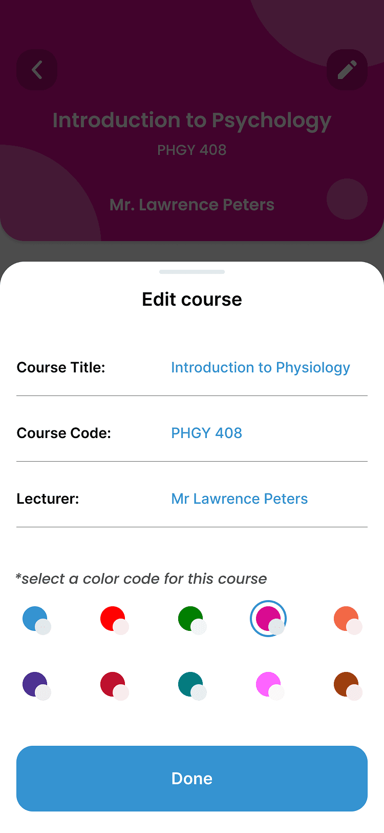
Style Guide
Concluding the initial research, I began to work on the visual elements of the product. In order to keep these elements consistent through their appealing nature, it was important to create a set of rules to guide my visual design and keep things consistent for users. Some of these elements include, color palettes, typography, components such as buttons and form fields etc.
For the typography, we felt the typography should be simple and easy to read, given the nature of the app being quite text heavy. The typography should also carry a sense of seriousness with a welcoming undertone
Inter
Inter
Screens
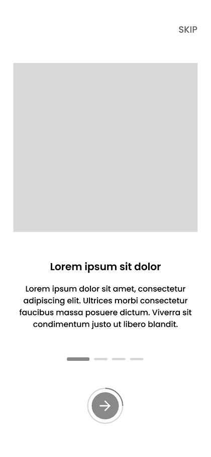
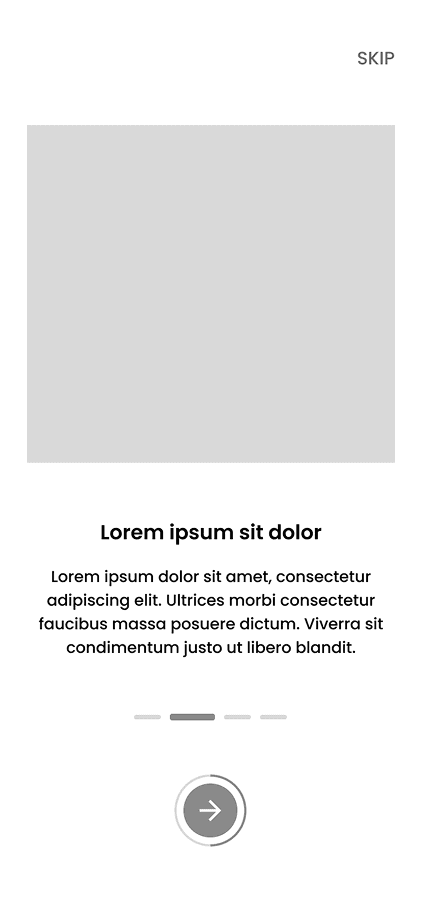
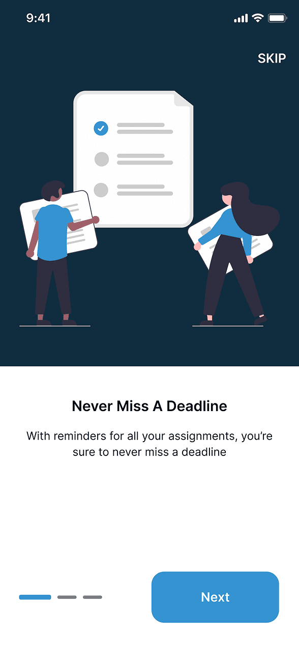
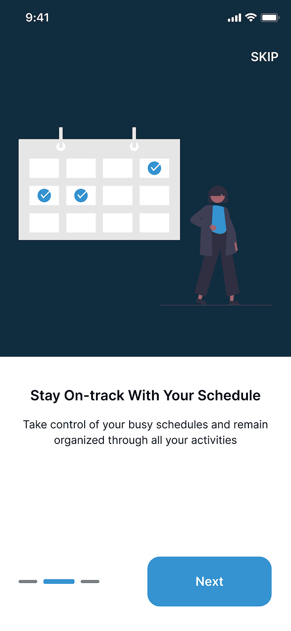
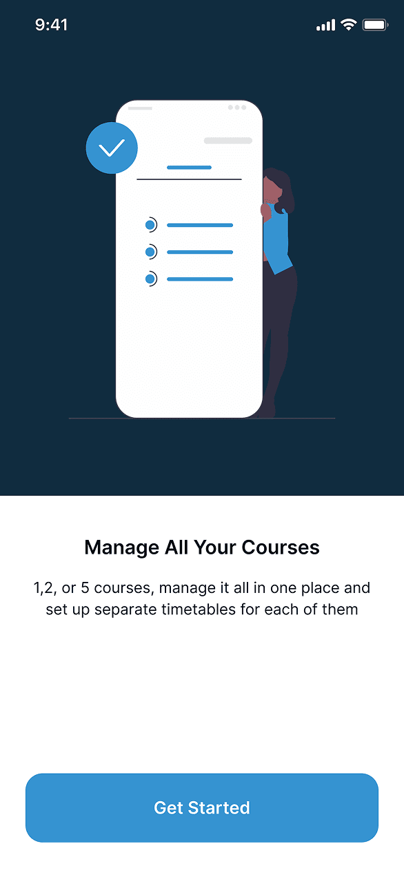
ONBOARDING
The on-boarding screens were included to give users a brief overview of the features UNEE has to offer and keep them informed before getting into the app.
The previous app did not have onboarding screens

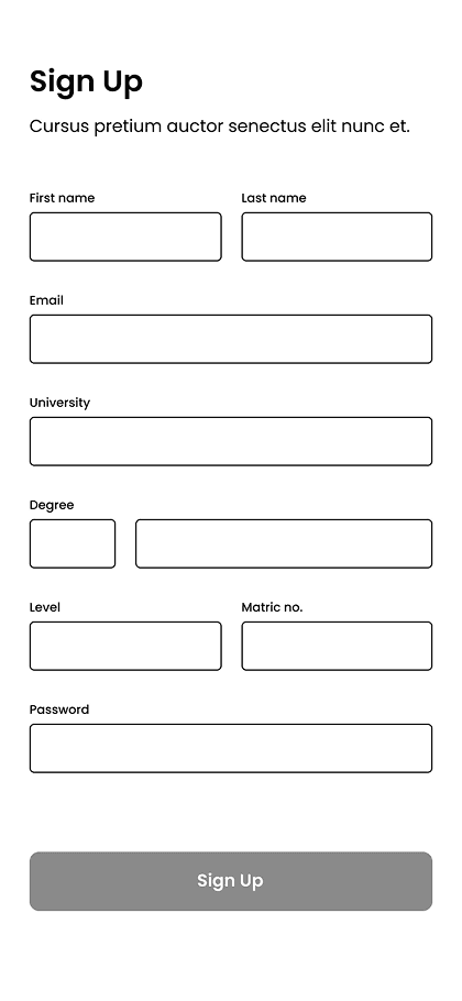
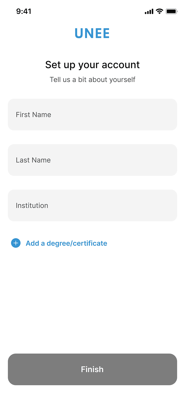
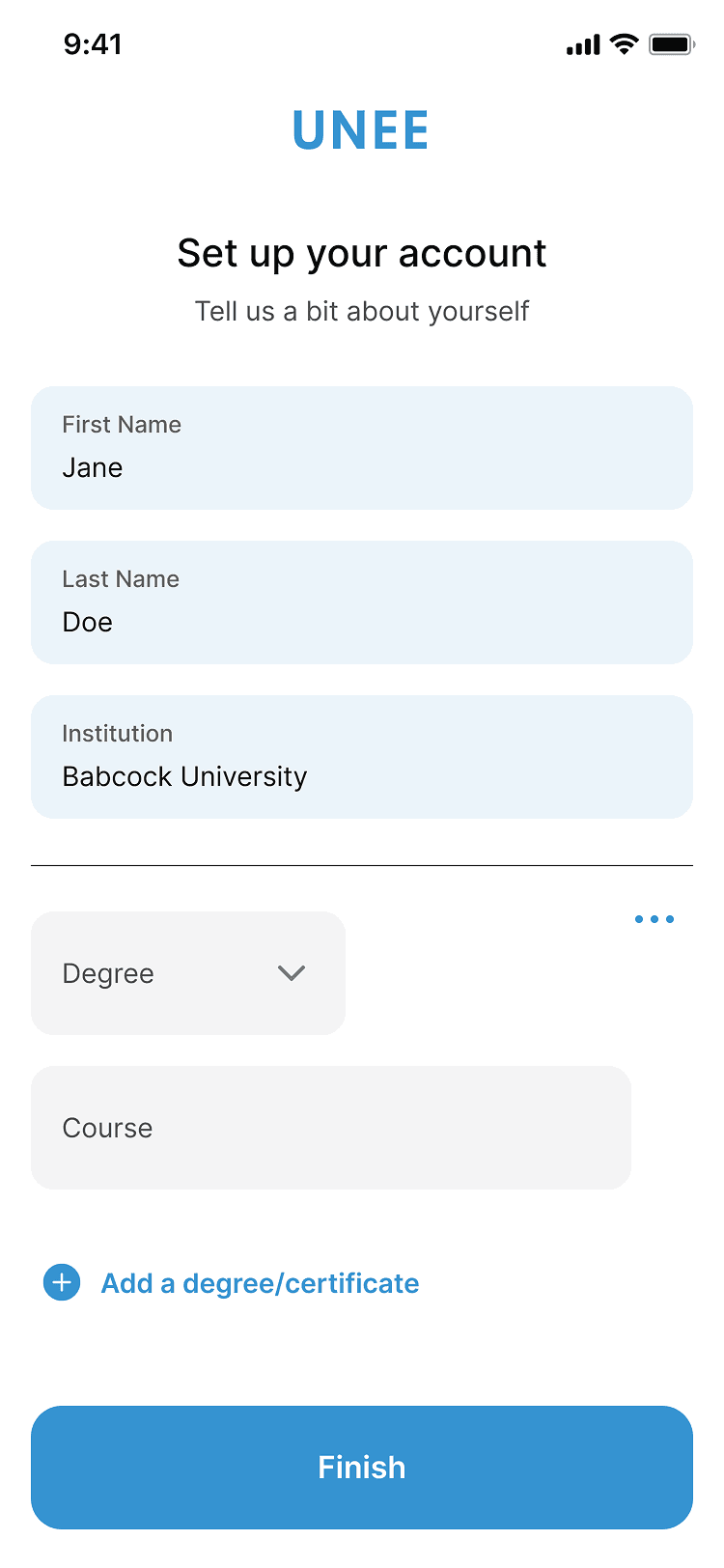
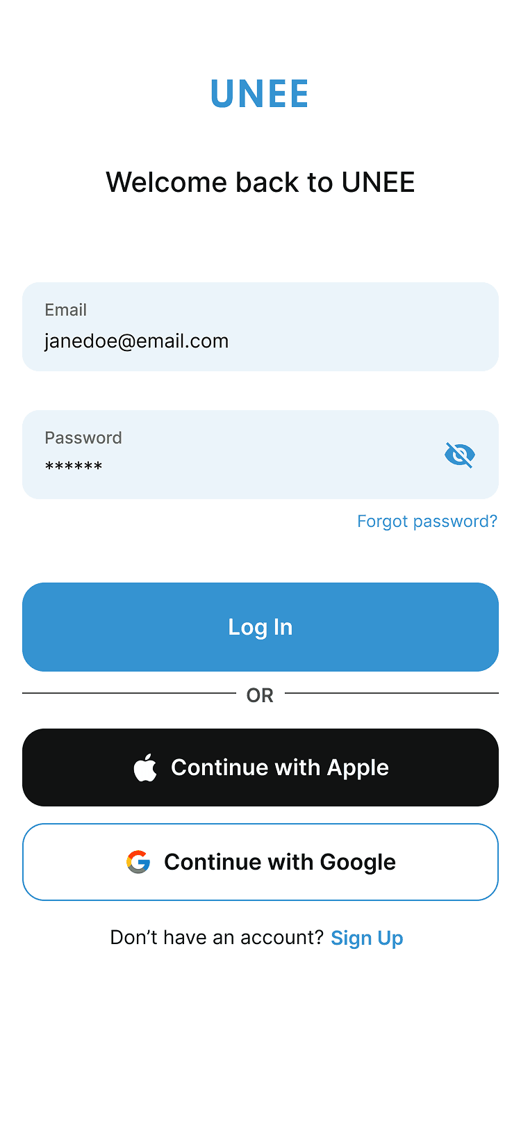
REGISTERATION
Users are prompted to either sign in with their email and password or go through the sign up process and fill relevant details.
The sign up process also includes SSO (Single Identity Sign On)
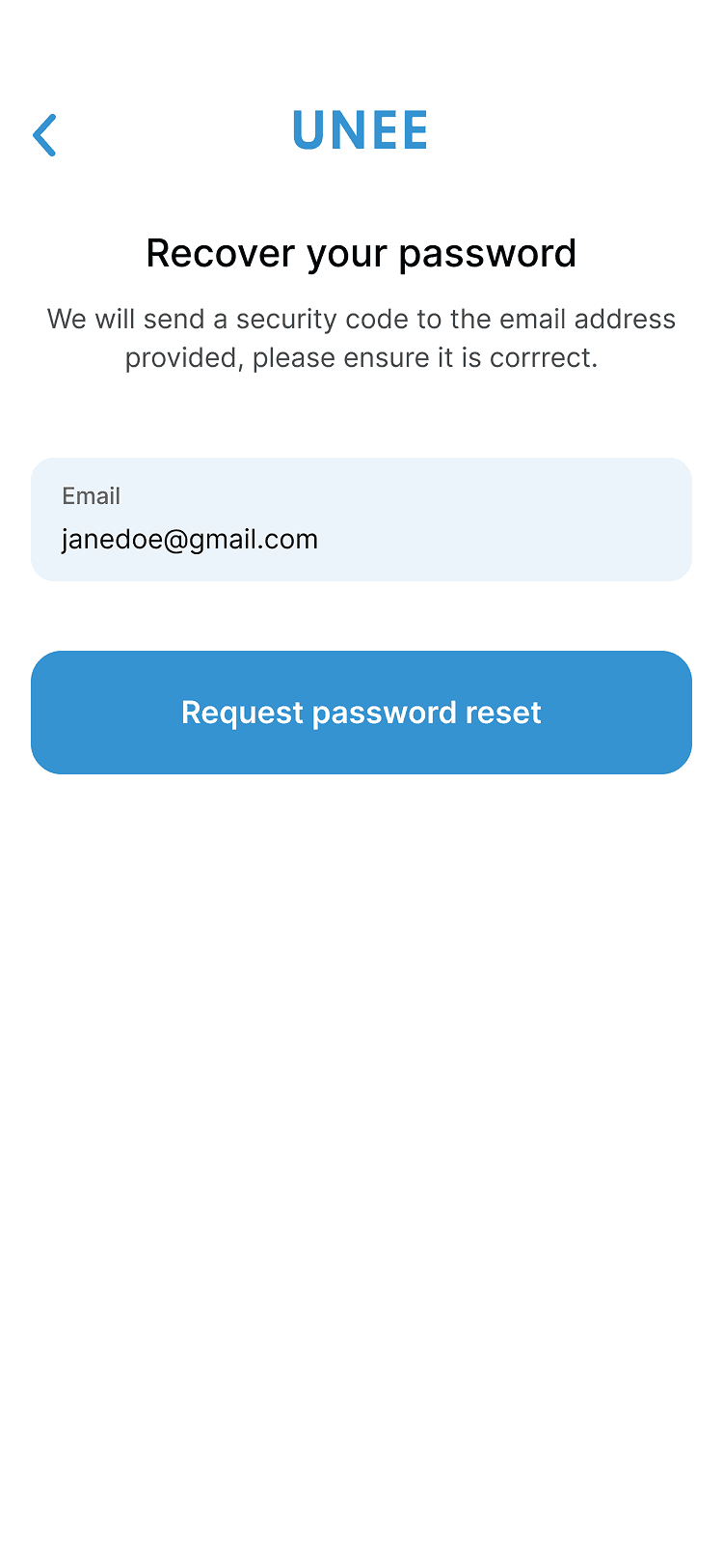
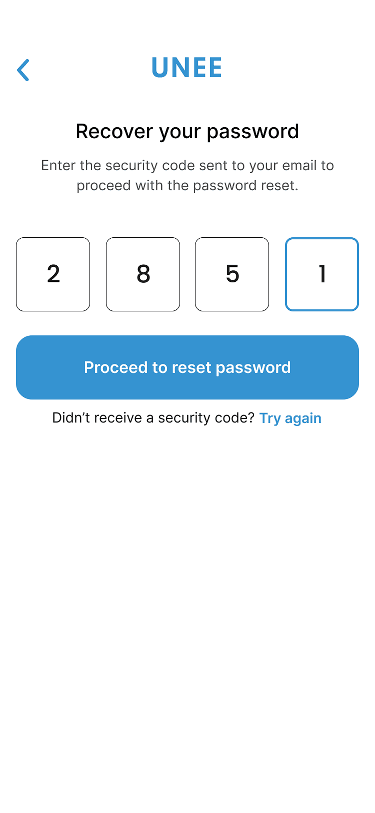
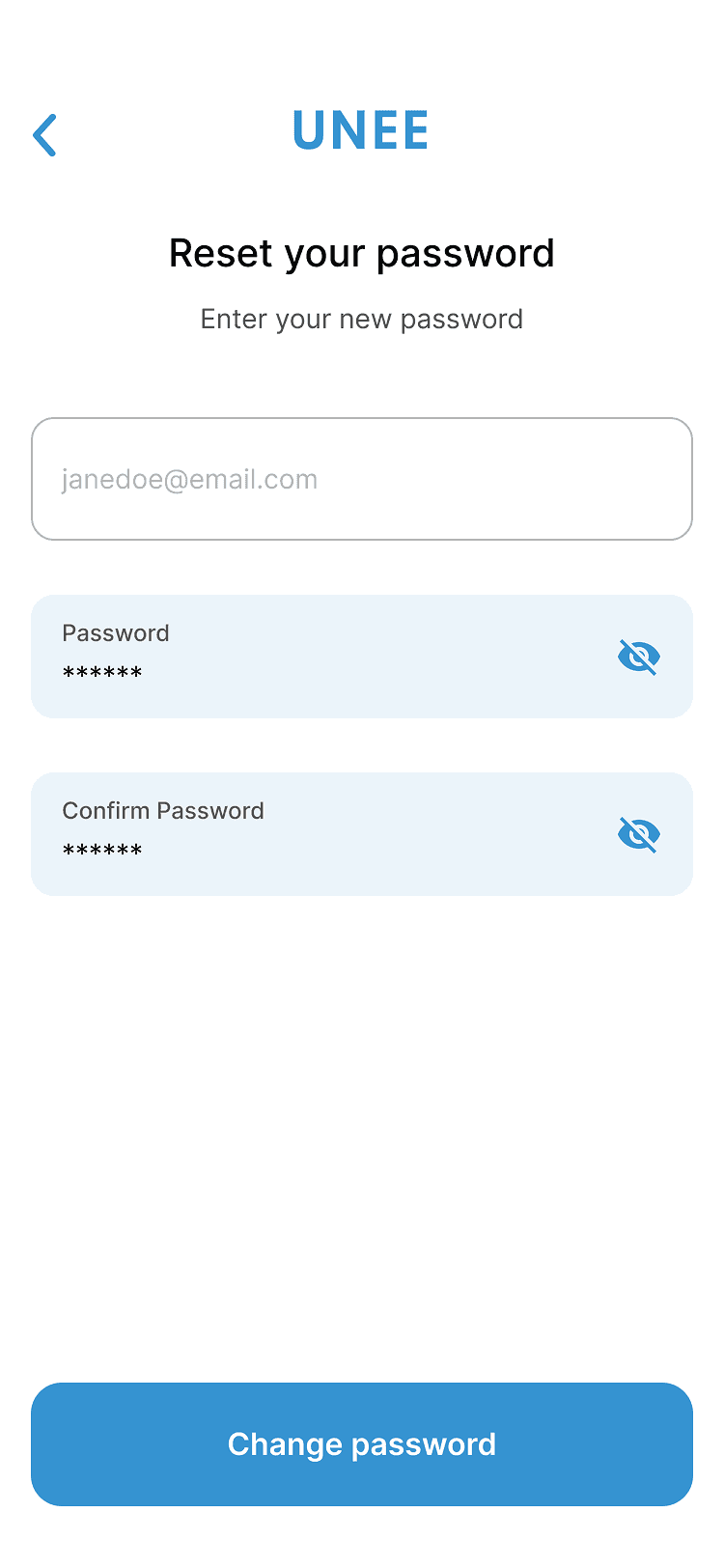
FORGOT PASSWORD
Implemented a forgot password flow to help users maintain access to their account when they lose their password.
The previous app had a forgot password button but no corresponding flow and was not functional
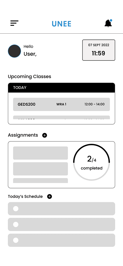
DASHBOARD
The dashboard section gives the user an overview of the information they need for the day with color coded classes and schedule for the day, as well as assignment deadlines with color codes to depict urgency.
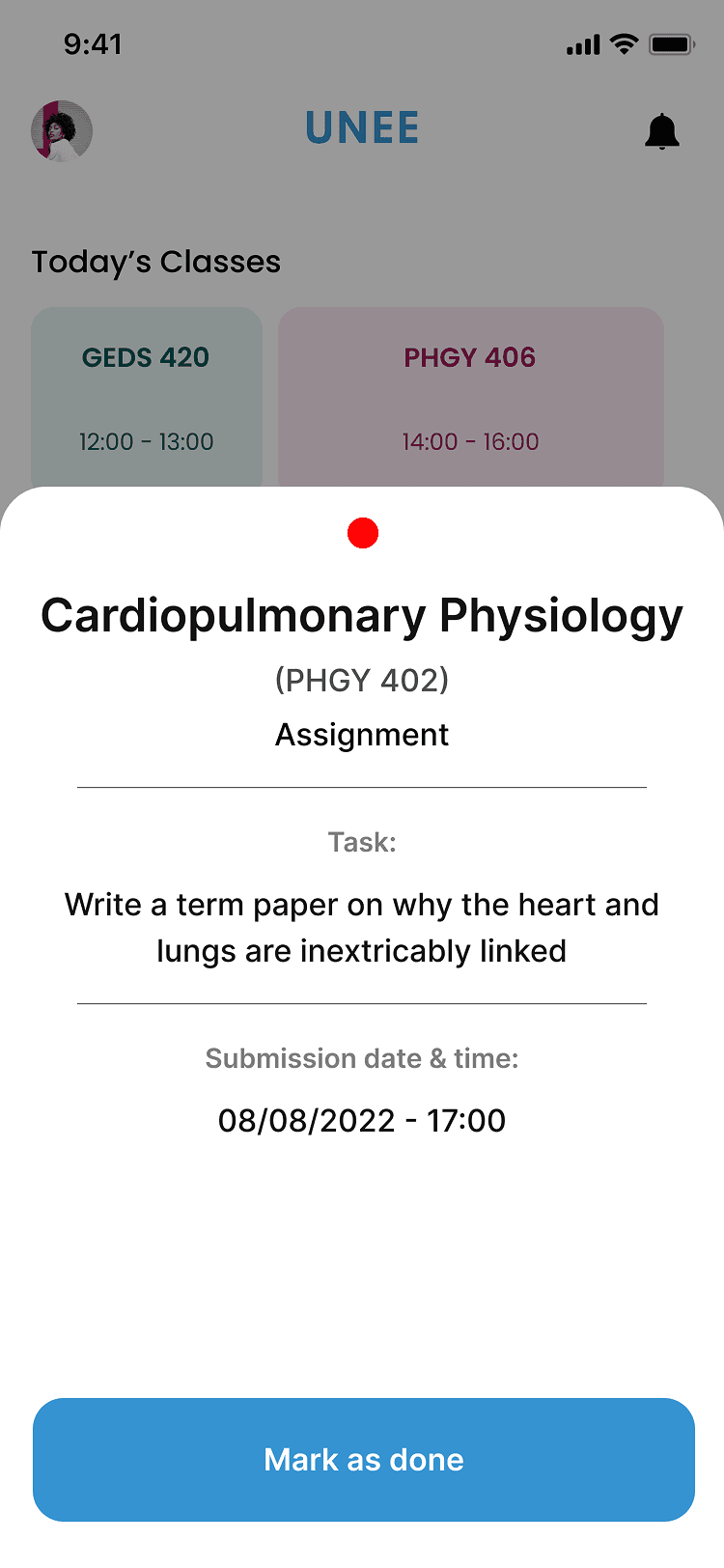
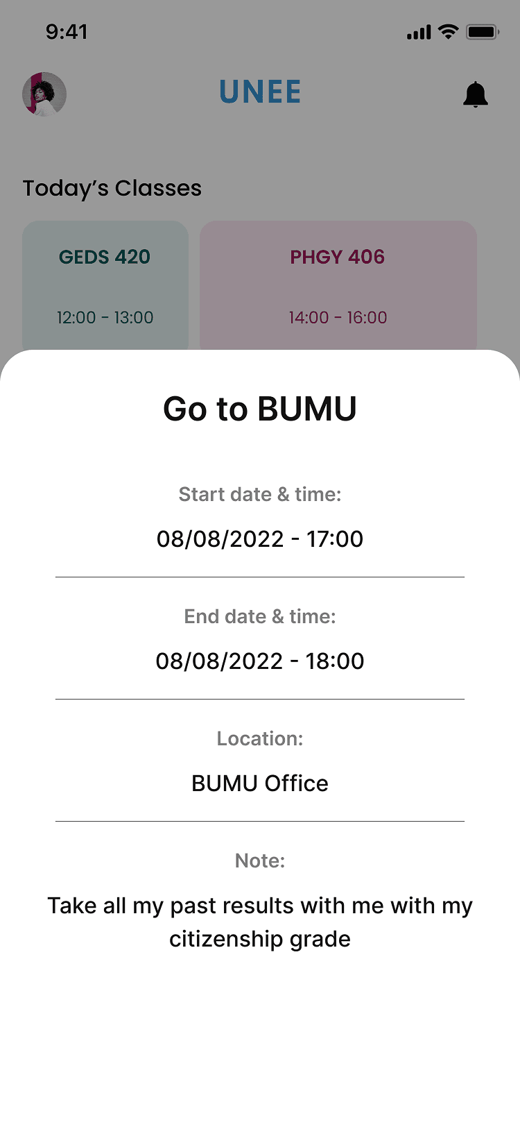
Users can also click into elements to get more information on each item
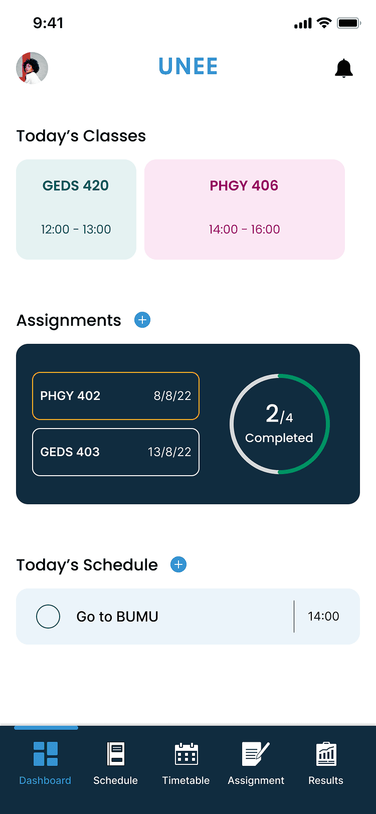
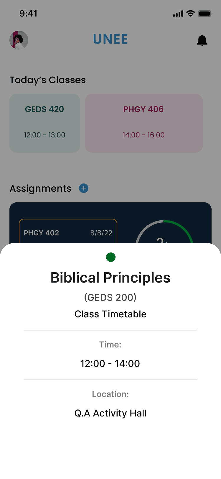
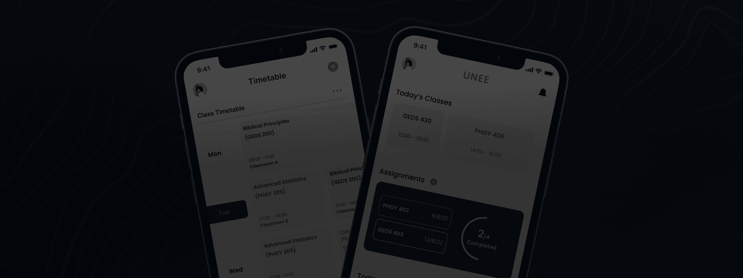
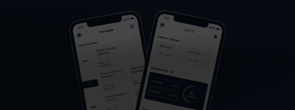
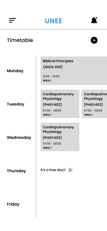
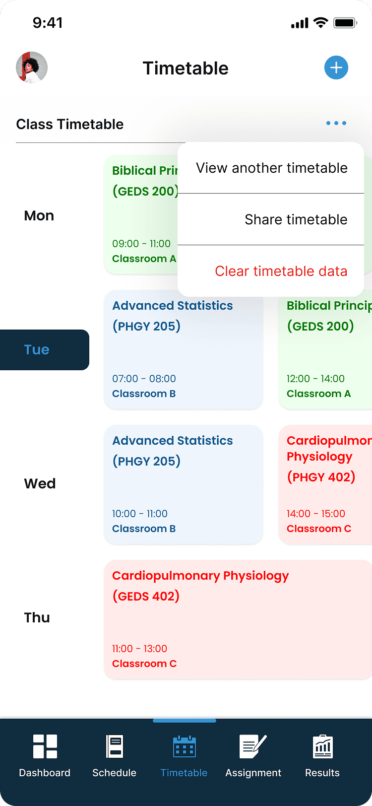
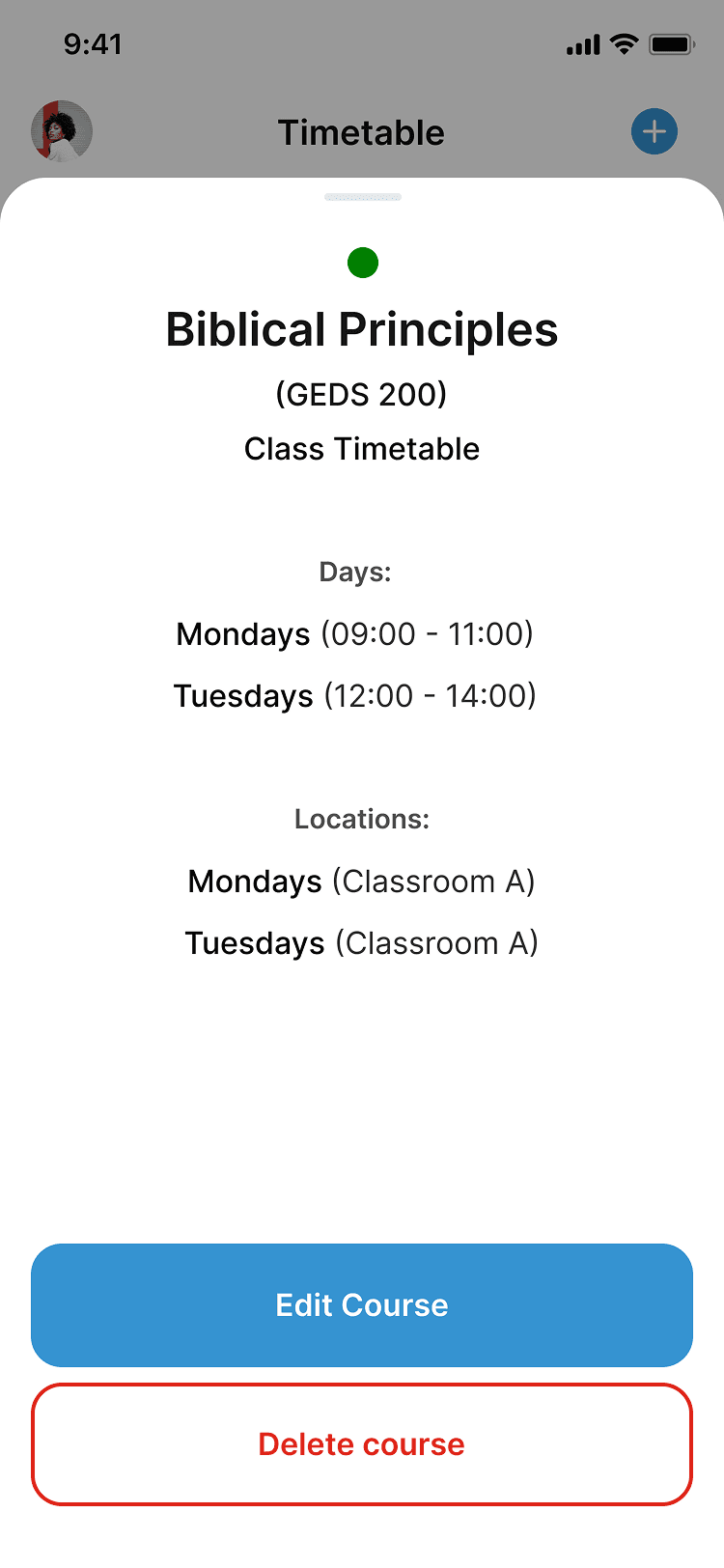
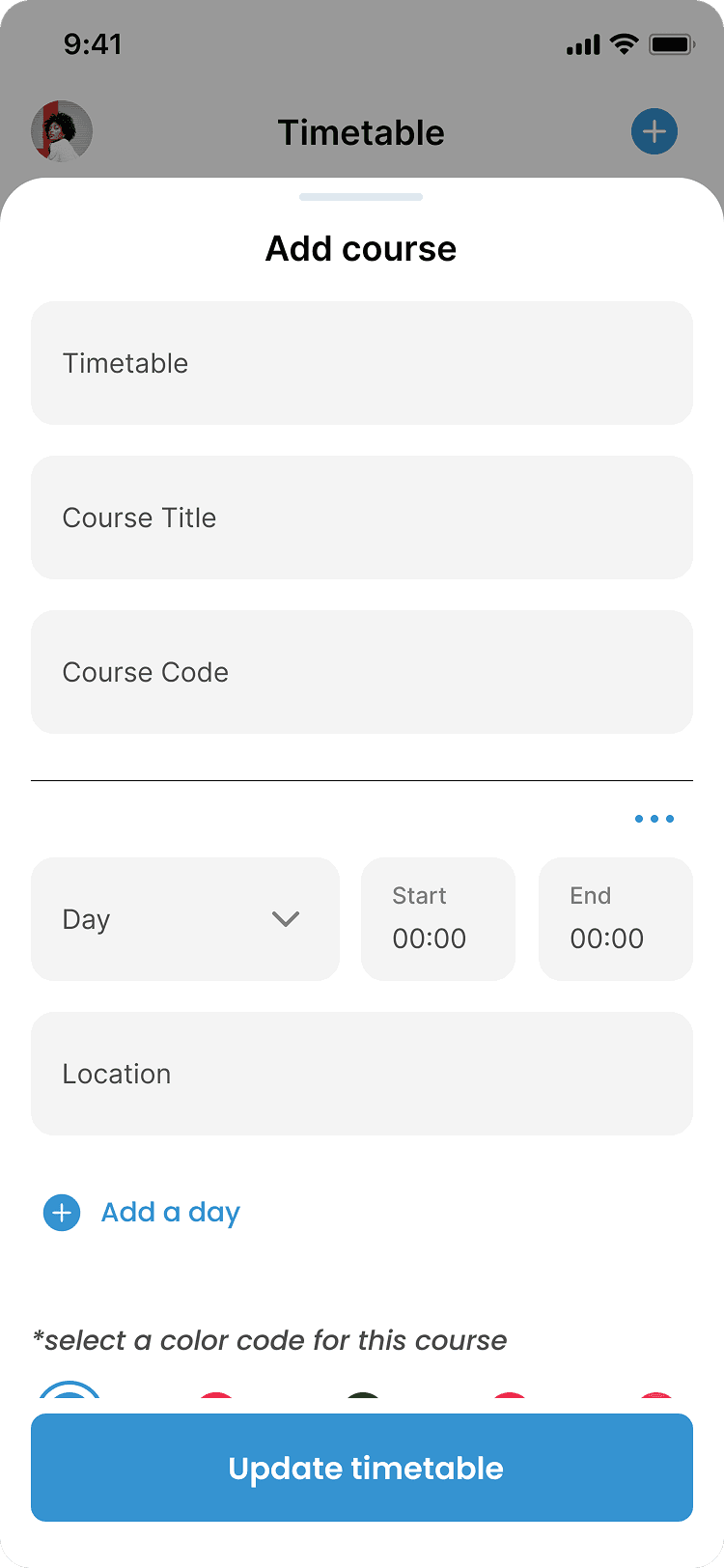
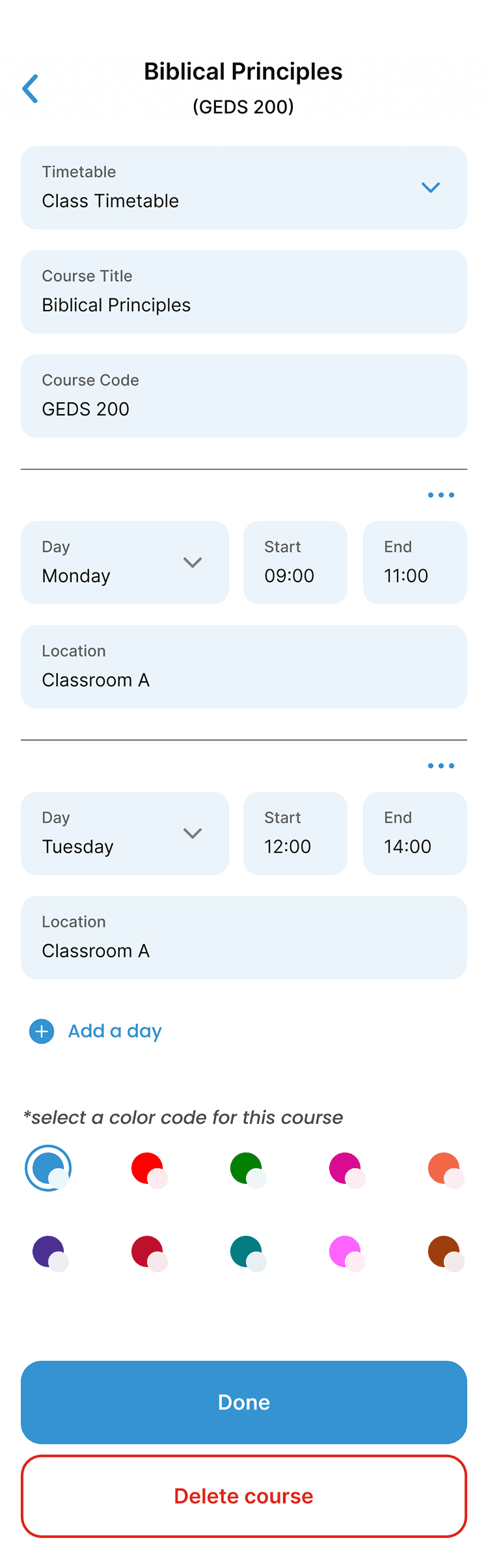
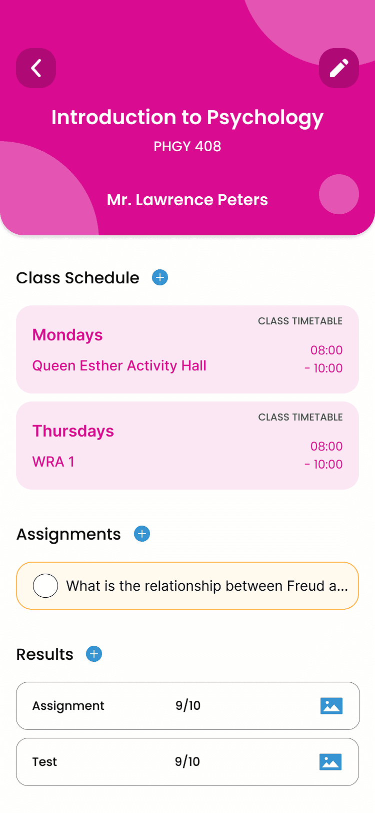
TIMETABLE
In the timetable section, users can put in their various courses under their timetable so they will reminded ahead of each class, Each course is color coded and the length of the course box translates directly to the length of time of the class
Users have access to multiple timetables and can share their timetables
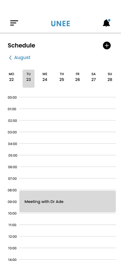
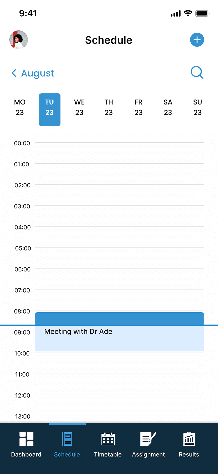
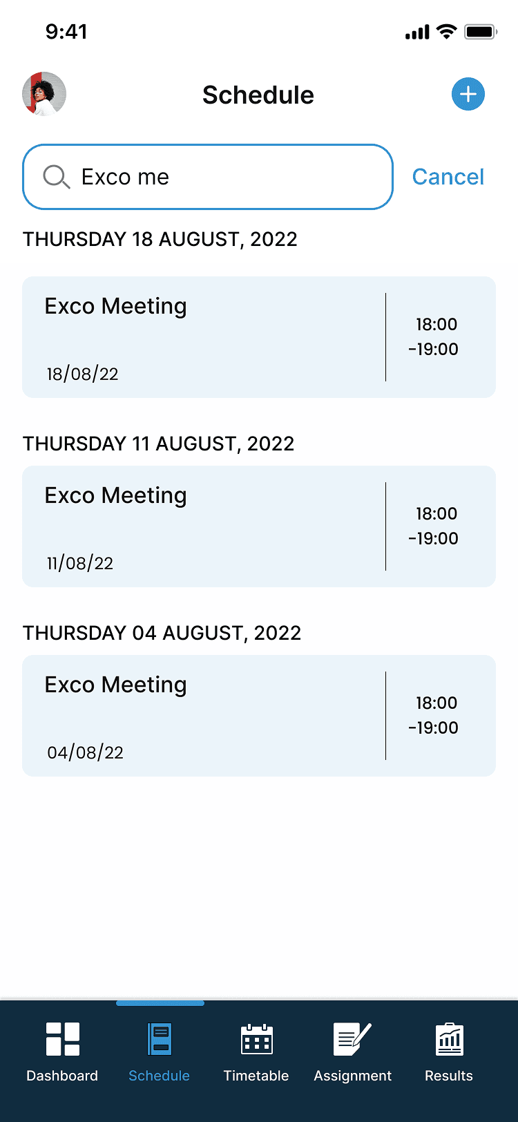
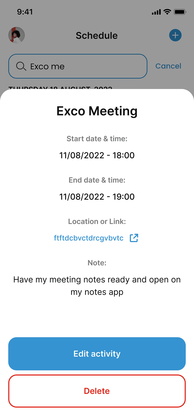
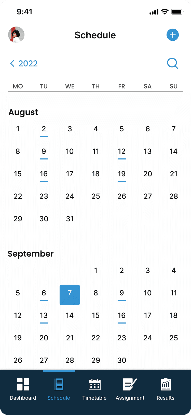
SCHEDULE
Users are able to easily plan their school activities here and have this information on their dashboard and reminders to keep them accountable for the tasks they have coming up
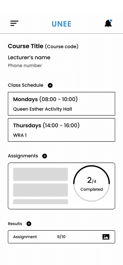
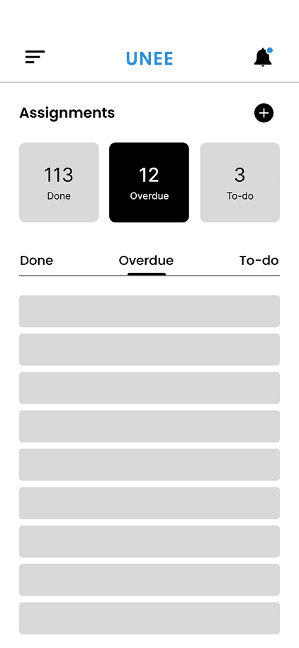
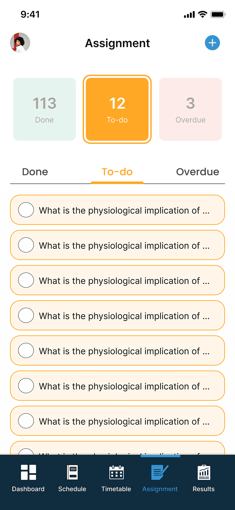
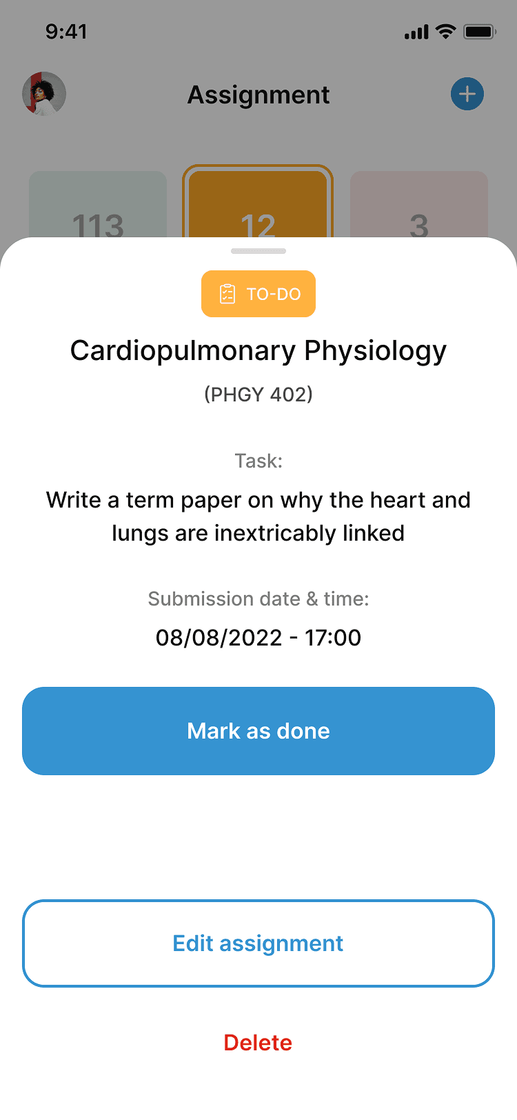
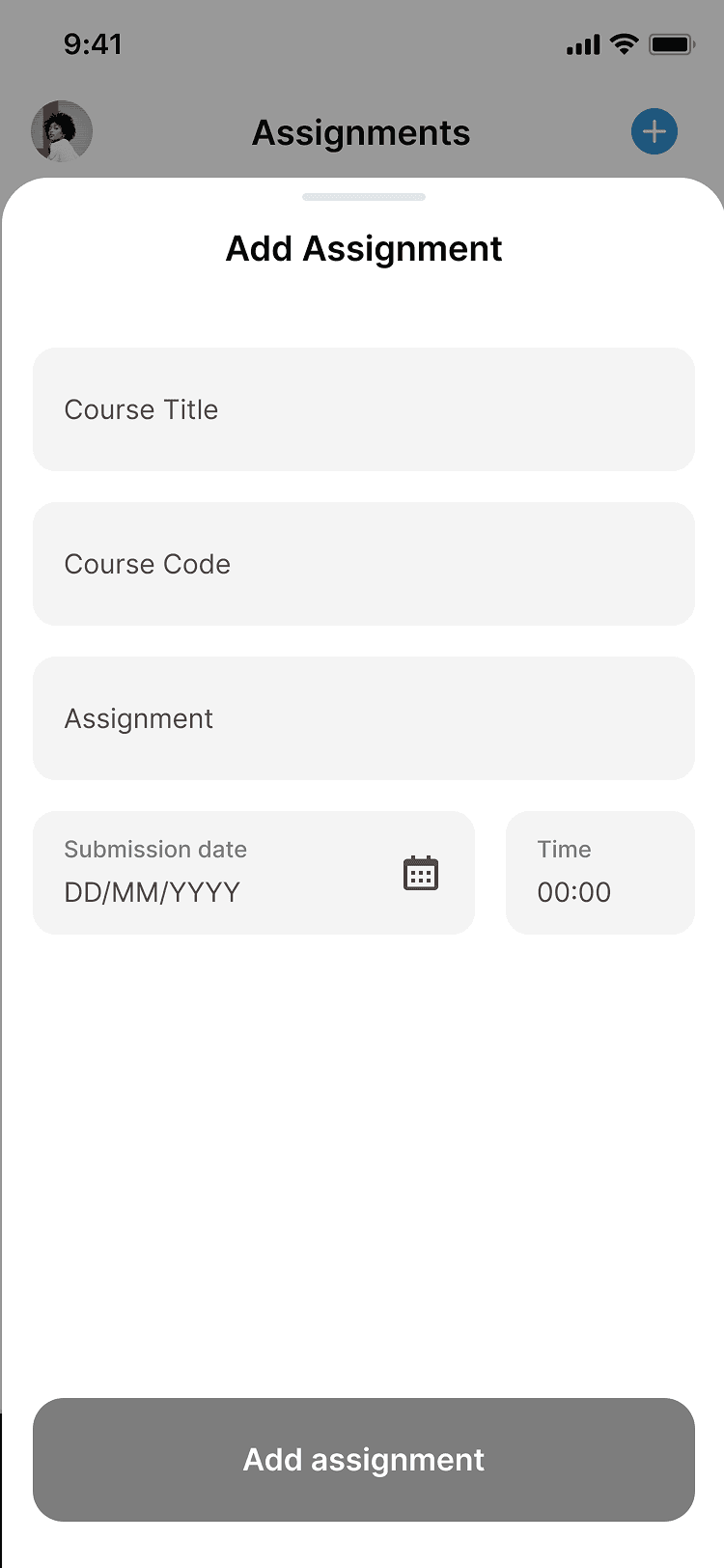
ASSIGNMENTS
Users are able to keep records of assignments given in class and this section is properly divided into to do, done, and overdue.
The assignment status is color coded and students can access this rom their dashboard
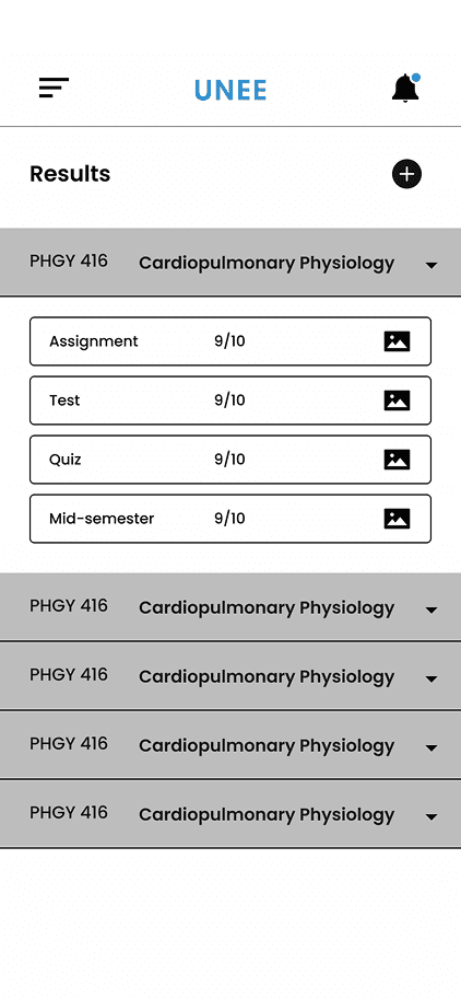
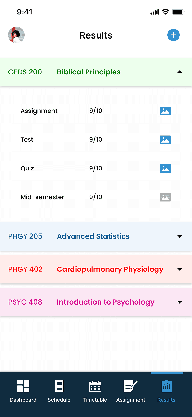
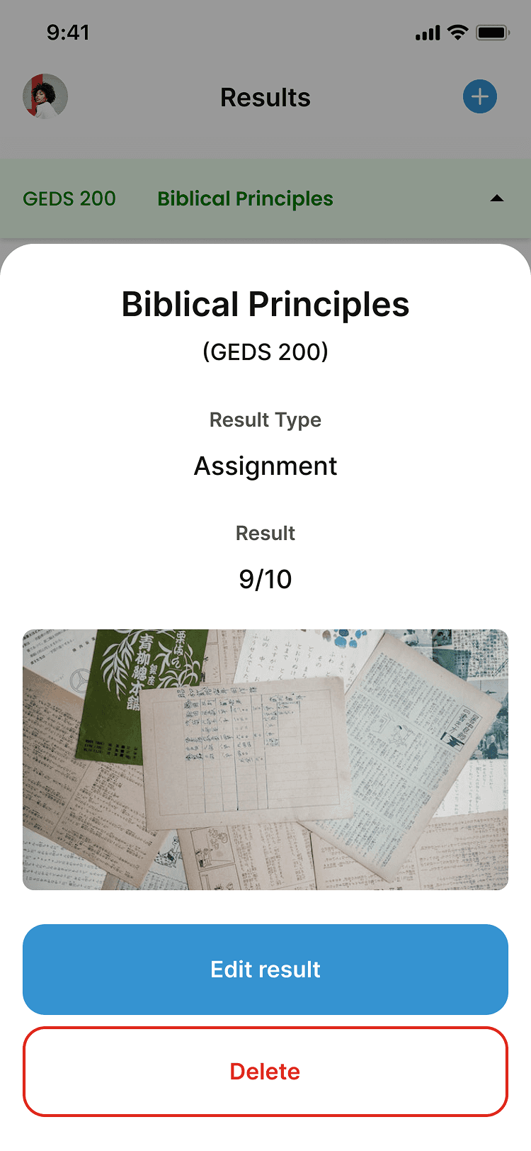
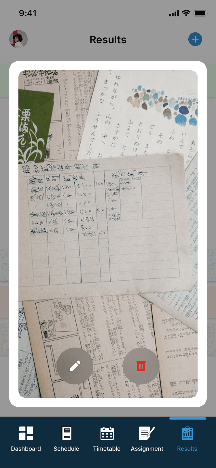
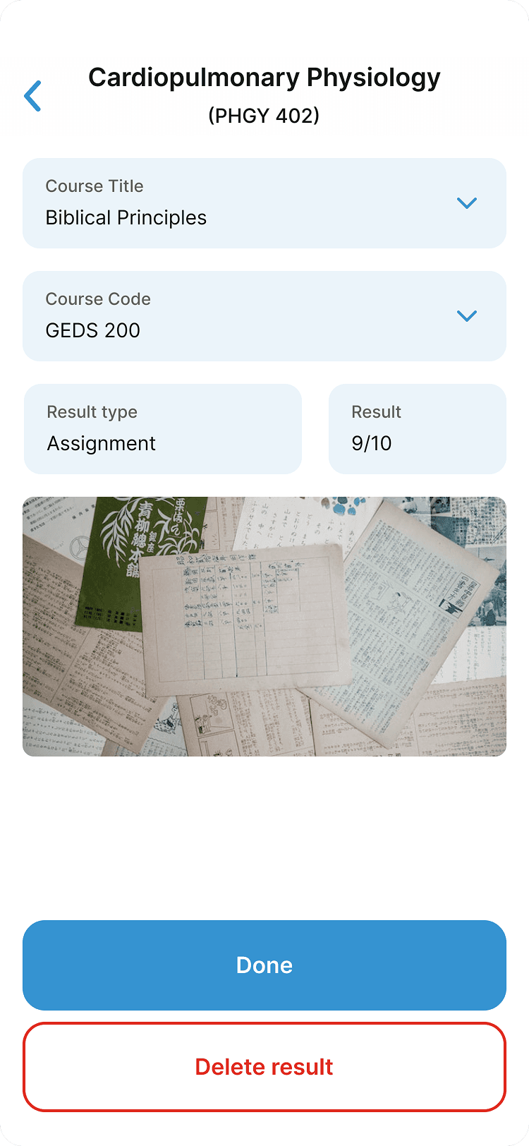
RESULTS
Students can keep records of their results across different tests, from assignments to test results to exams for each course.
Users can attach pictorial evidence of their results for authenticity and to avoid situations of missing results
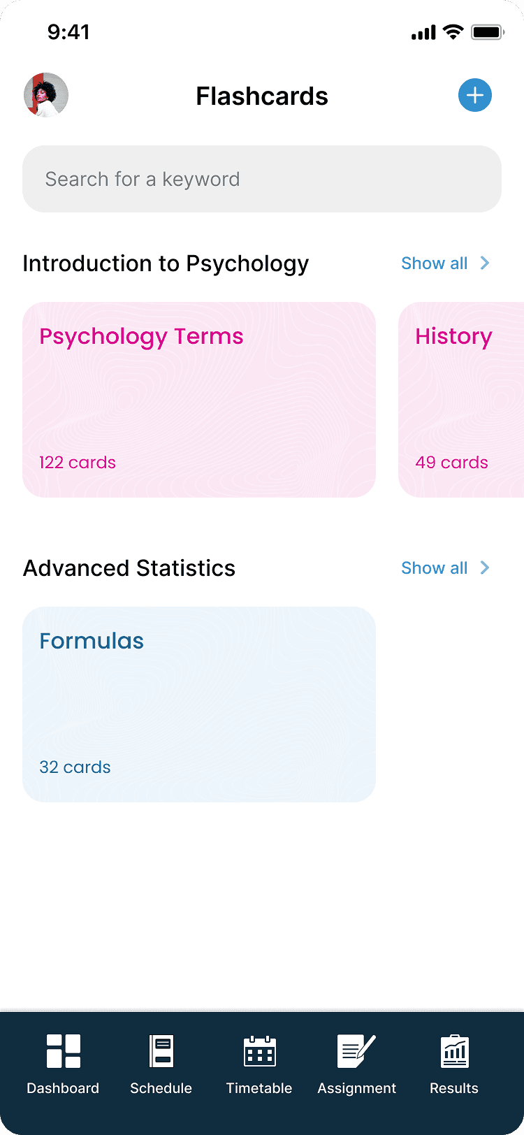
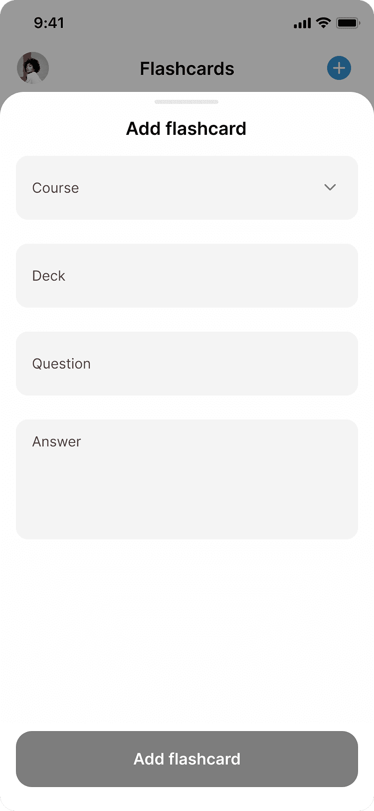
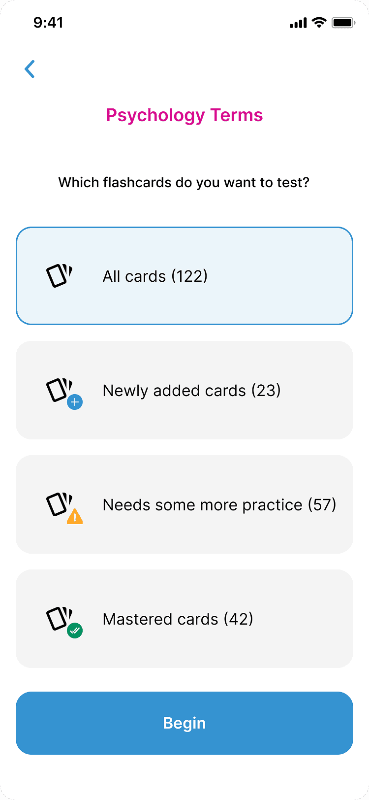
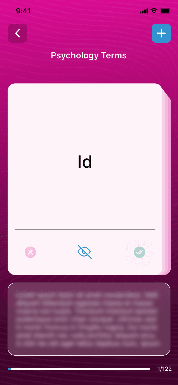
FLASHCARDS
The flashcard feature helps users study for each course in their timetable and it allows student groups to quiz themselves with their respective flashcards.
As users progress on a particular card, the cards are categorized into new, need some more practice, and mastered cards
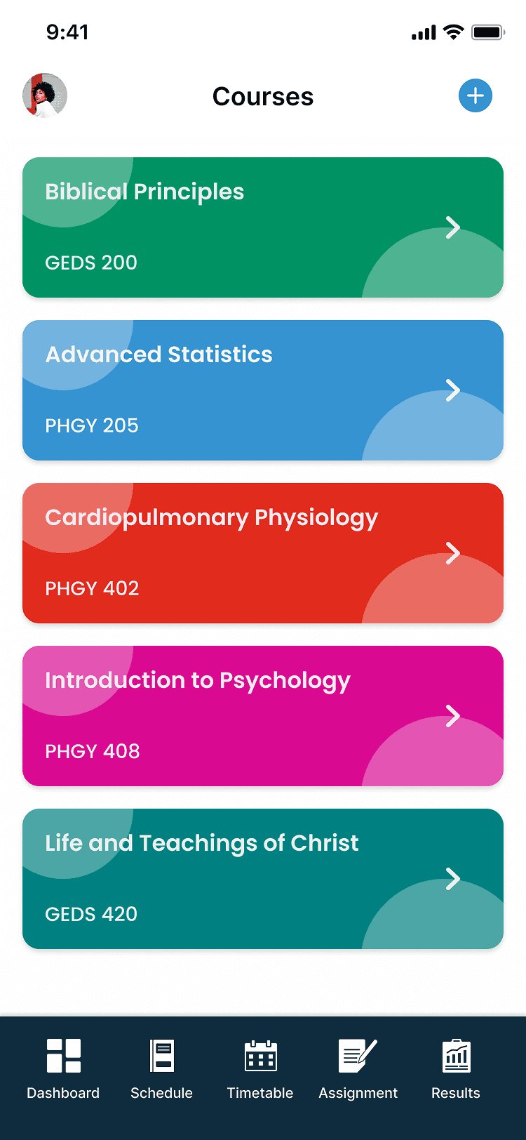
COURSES
The courses section gives users a central access point an overview of each course along with details such as course name, course code, lecturer name, schedule, assignments, and results
LET’S WORK TOGETHER
Have a project, collaboration, or idea in mind? I’d love to hear from you.