
CASE STUDY
oneEdo
Helping residents of Edo state, Nigeria access government services
The problem
There is currently no reliable way for residents to easily access Edo State government services and information online
The solution
A unified digital government services platform for Edo State that empowers residents by providing access to information.
Tools
Figma, Figjam, Slides
Role
UX & Interaction Designer
Timeline
8 weeks

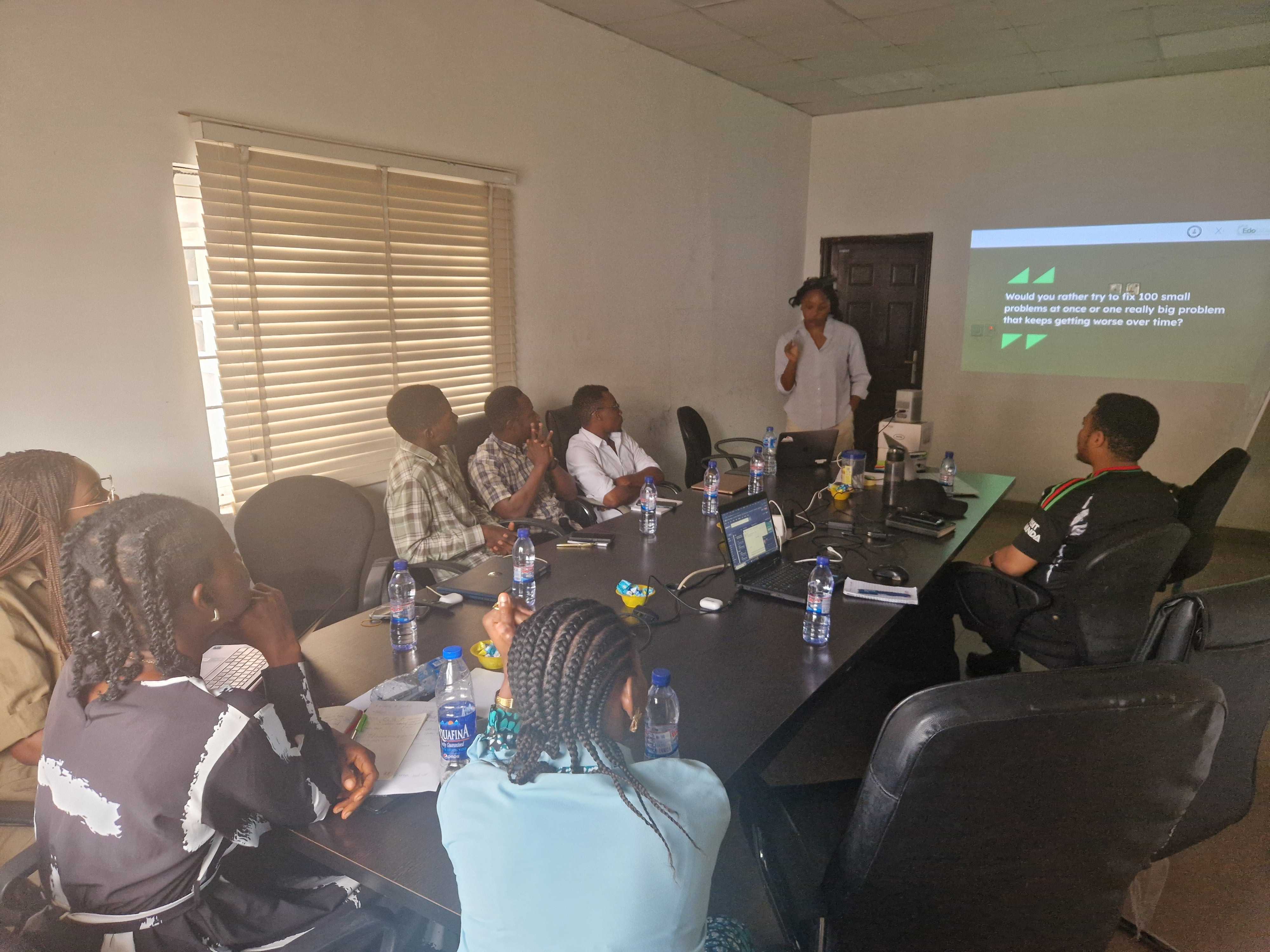
Discovery
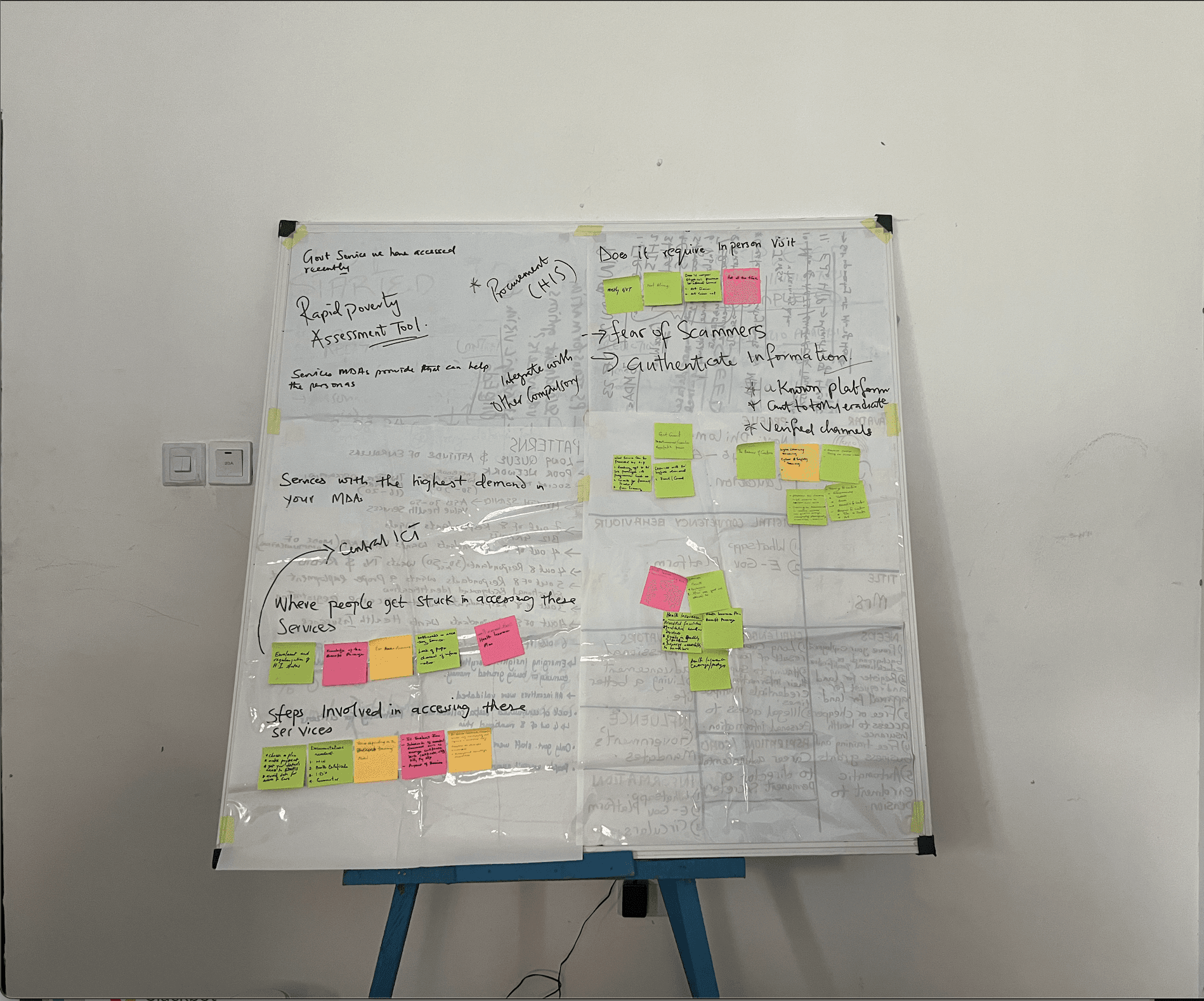
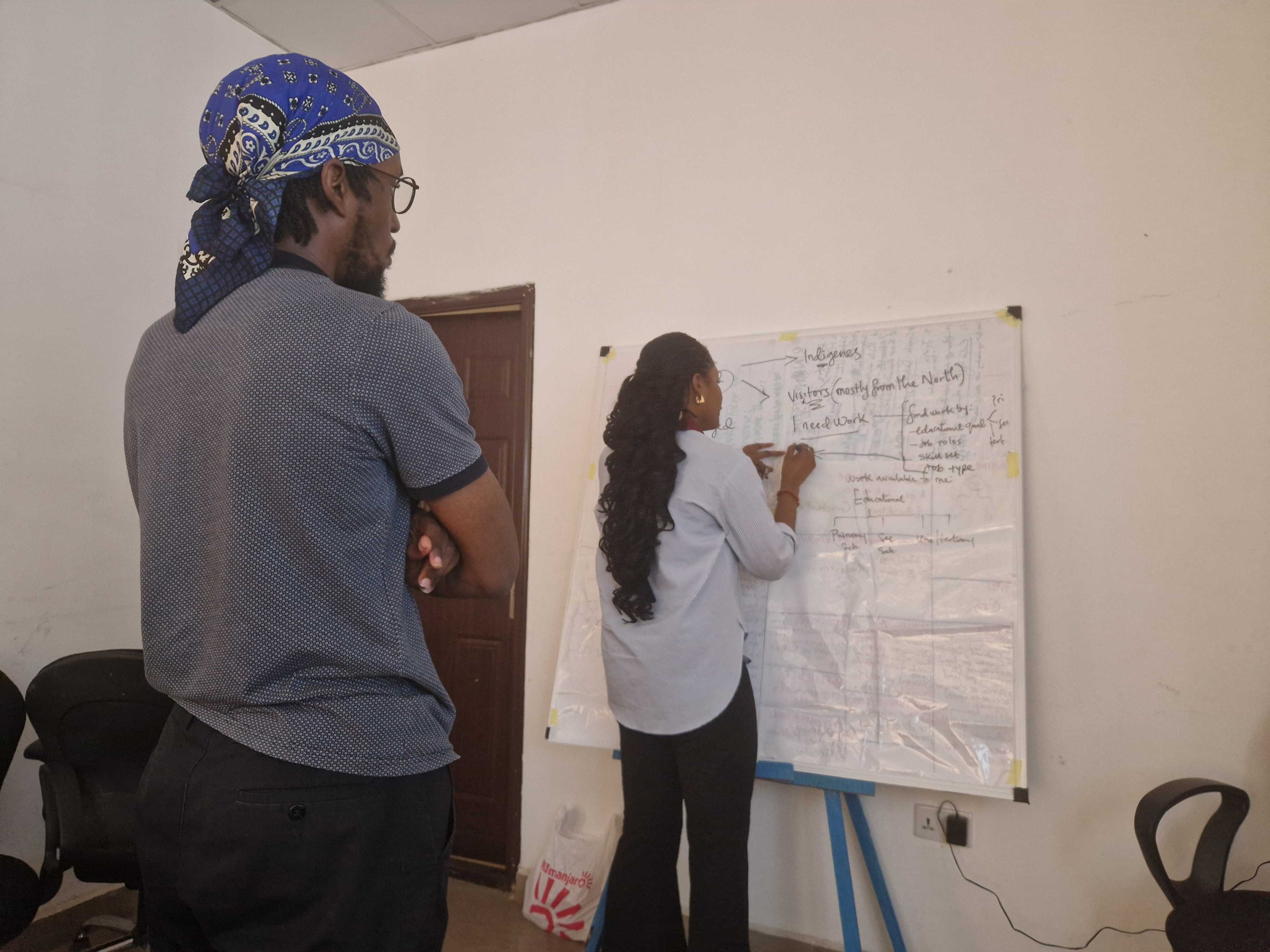
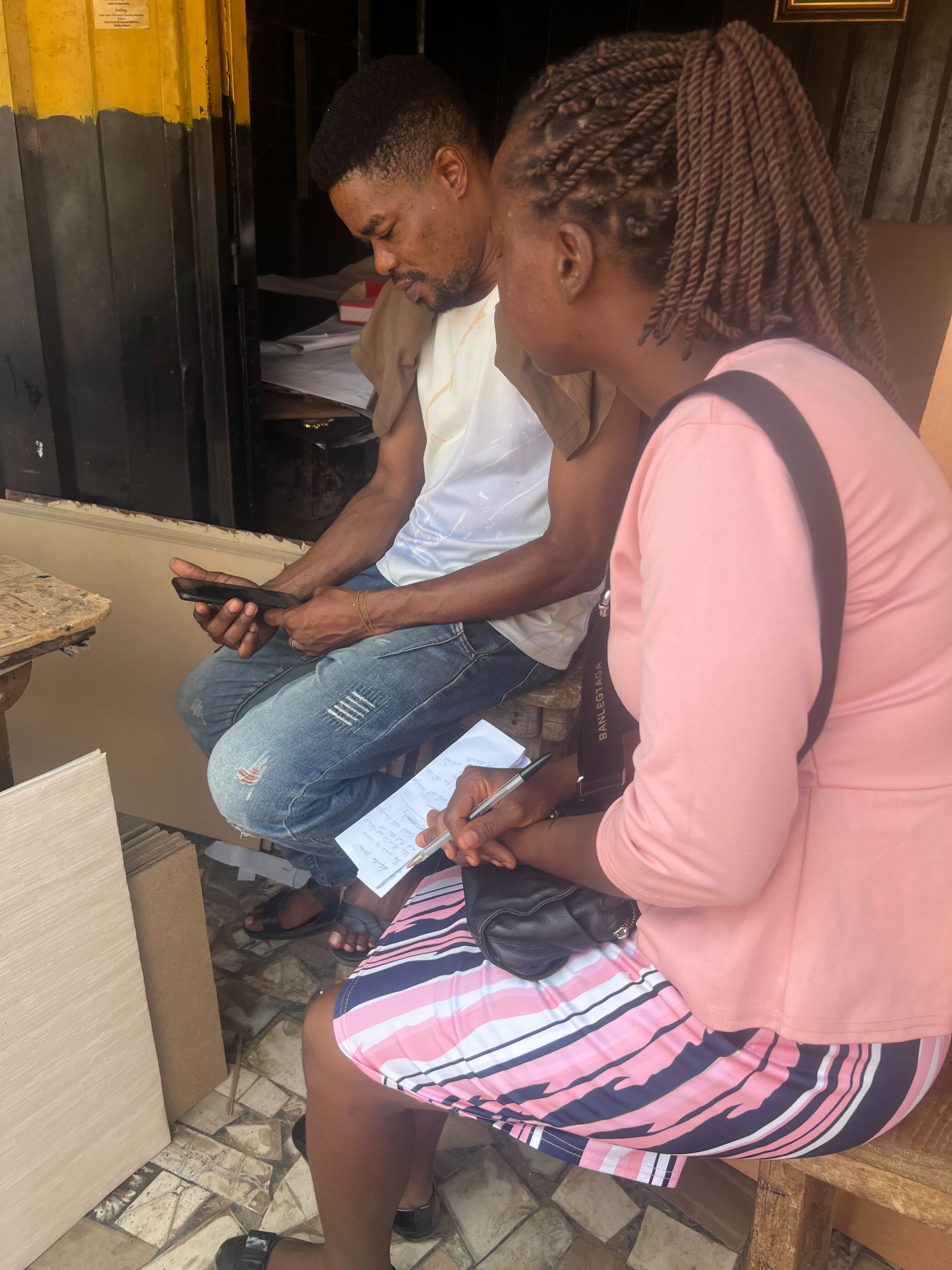
The research team set out, using various approaches, to understand the pain points and needs of residents in Edo state and also facilitated a workshop with MDAs (Ministries, Departments and Agencies) to get as much information as possible and close the gap between what is available and what is accessible by residents.
Providing residents with information is the first step in a 4-step phased approach in helping residents access government services
Research objective
To uncover and address residents’ needs, experiences, and pain points when accessing government services.
Research Approach
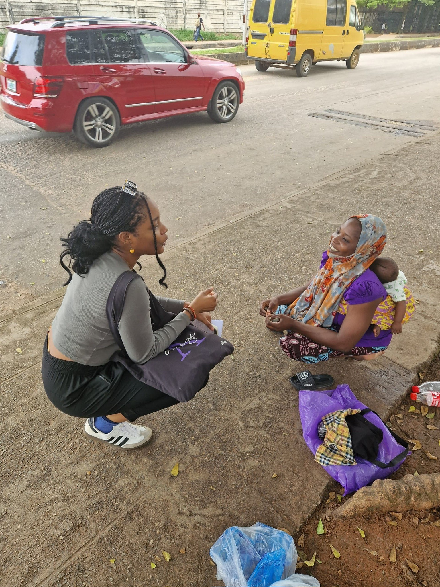
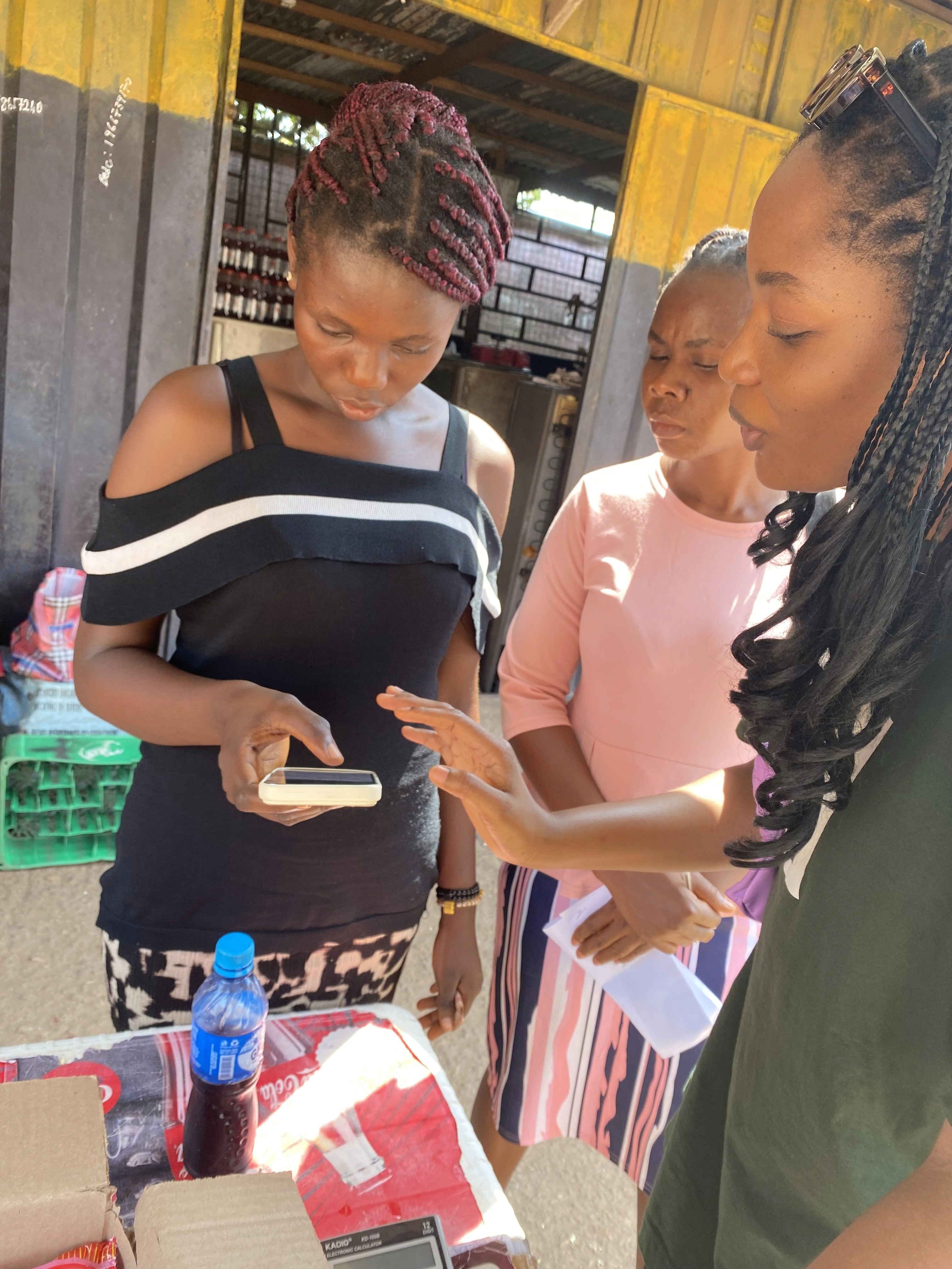
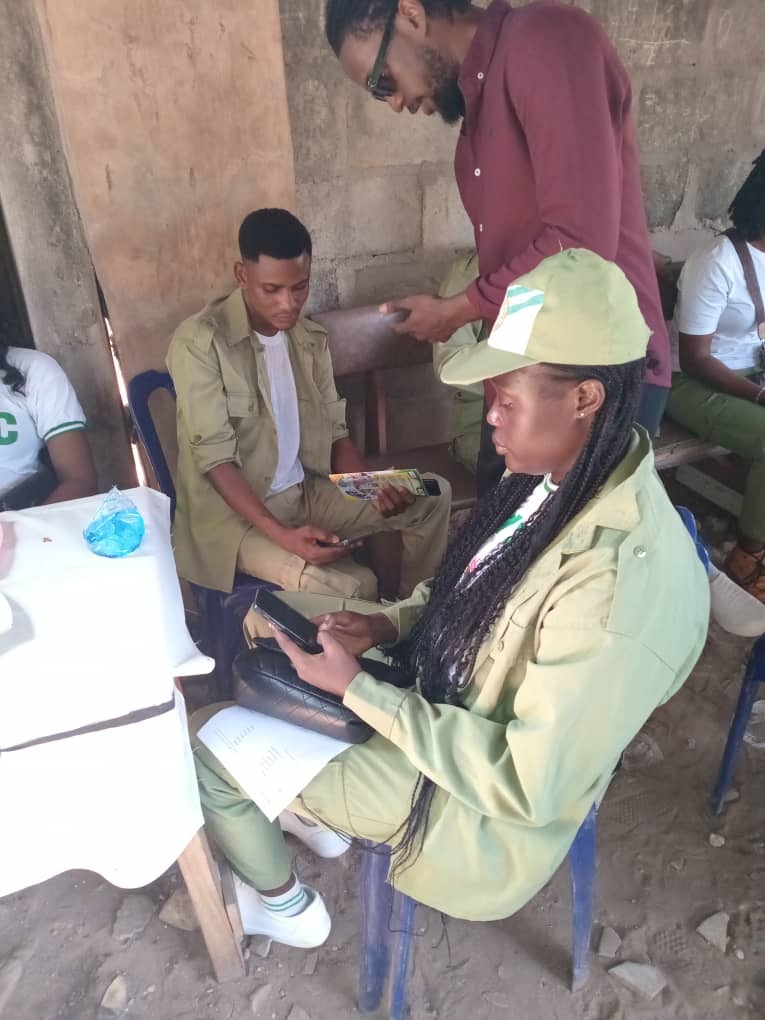
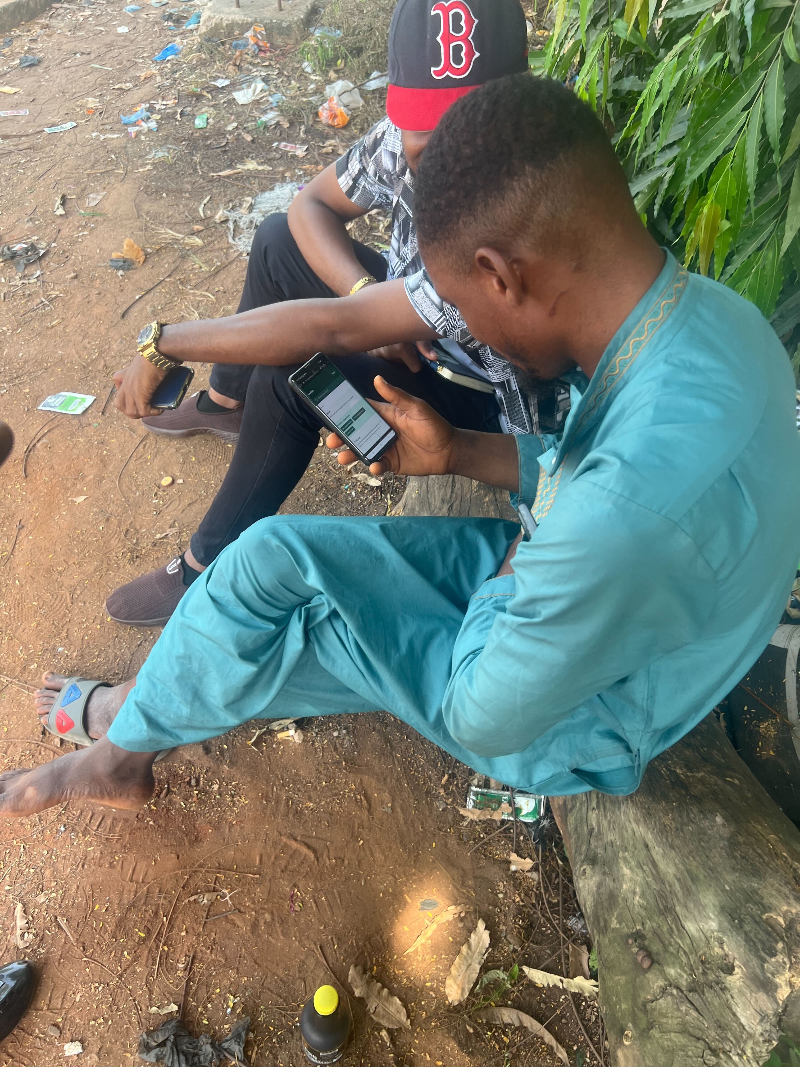
Contextual Observation
Surveys
Street Interviews
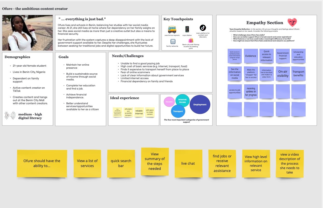
Persona Development
Usability Testing
What we found
Most citizens are unaware of available government services
Those who know about services struggle to access them
People rely heavily on in-person assistance due to a lack of trust
Information seeking is fragmented across physical locations
Top services: Employment, business loans, education and skill development, healthcare, social services and welfare


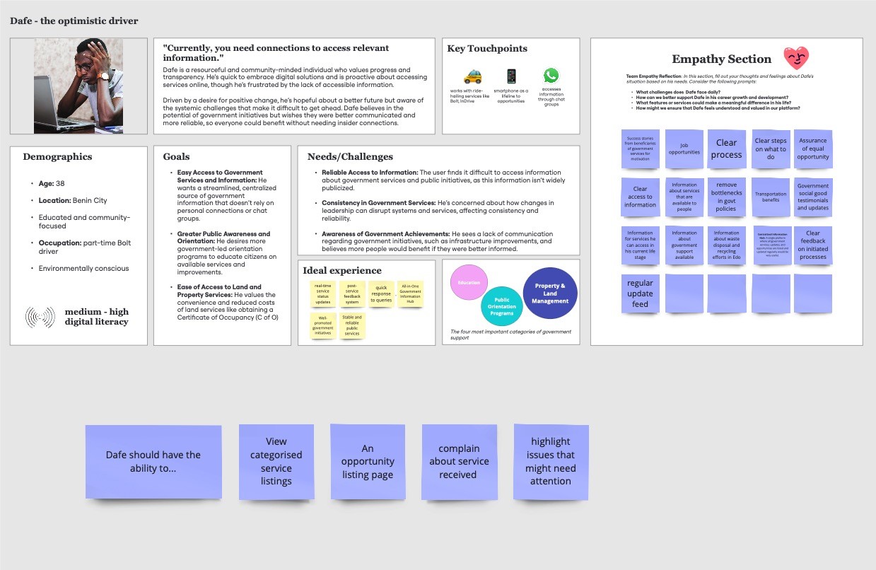
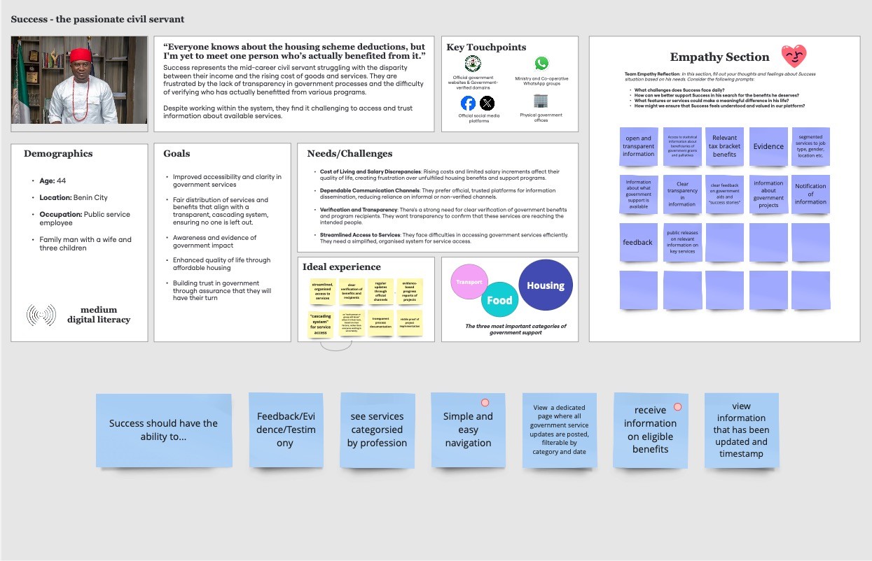
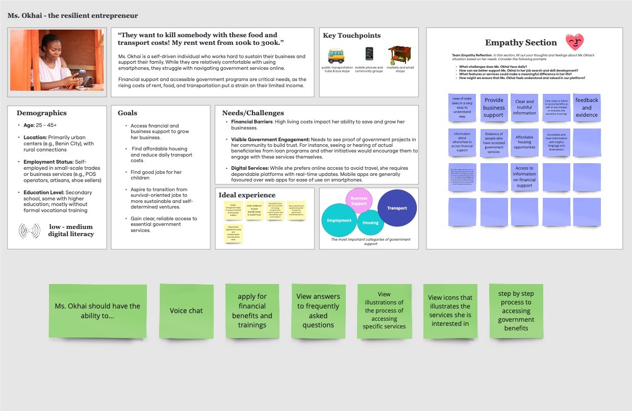
The initial research helped create the personas for this project and personas were defined under 4 main buckets:
Digital literacy
Location
Demographic
Most important service
Once the initial research and discovery was concluded, the insights were brought to the design team to design a home page that would effectively cater to the user’s needs and begin their journey on the platform.
Wireframe
With the insights gotten from the research team, the design process could begin. We took a user centered approach guided by the research. We needed to ensure the platform was:
Accessible
How easy it is for residents to access the platform across different literacy levels and internet connectivity.
Simple
How easy it is for users to navigate and understand the information on the platform.
Task Oriented
Clear and exact designs, ensuring users complete tasks as quickly as possible without any distractions.
Consistent
Ensuring elements used in the design were consistent across all pages to build trust.
Users do not know much about government structure and they should not need to to access services available to them. All they need to worry about is what they need and how they can access it.
With this in mind, the design was built around services, rather than departments and agencies
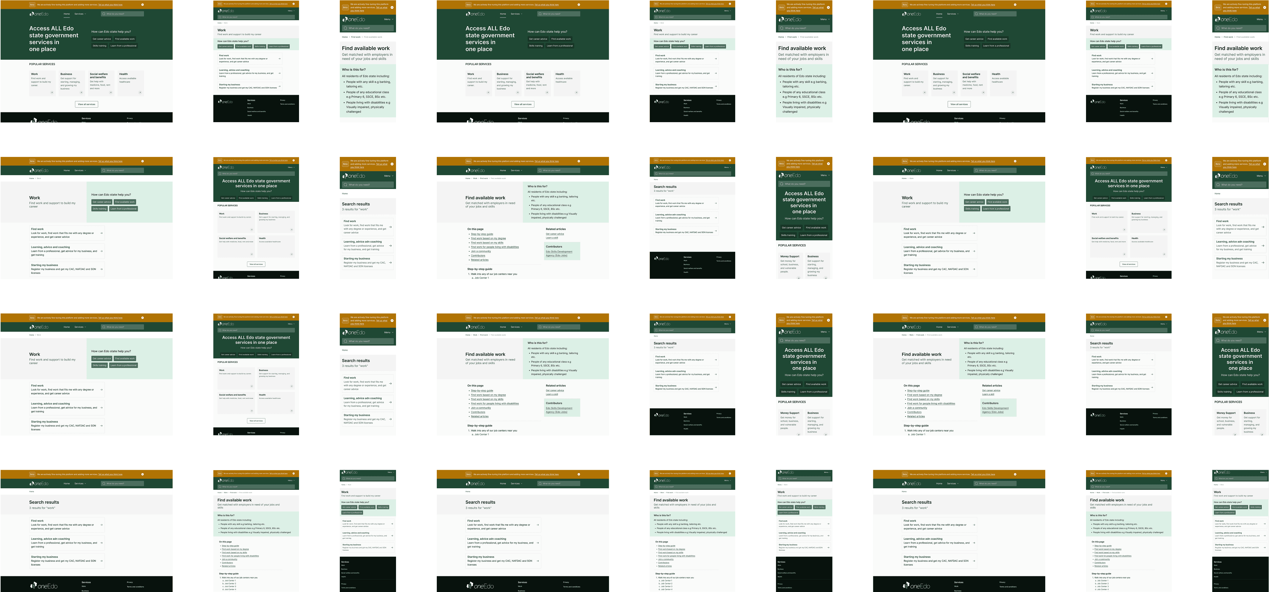
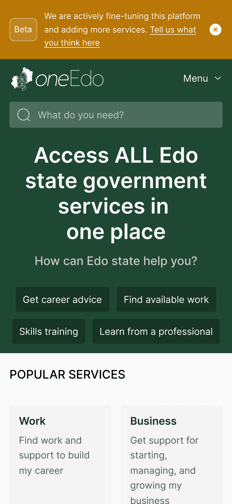
Taking these into consideration, the initial wireframe was created quickly and was used to test the layout and copy with users to ensure we were headed in the right direction and creating something functional for users, before adding other elements like color. We took a mobile first approach with the design, understanding that majority of our users would interact with the platform on a mobile phone as opposed to a larger screen like a desktop.
Interface Elements and Logic
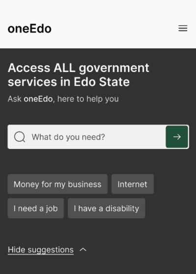
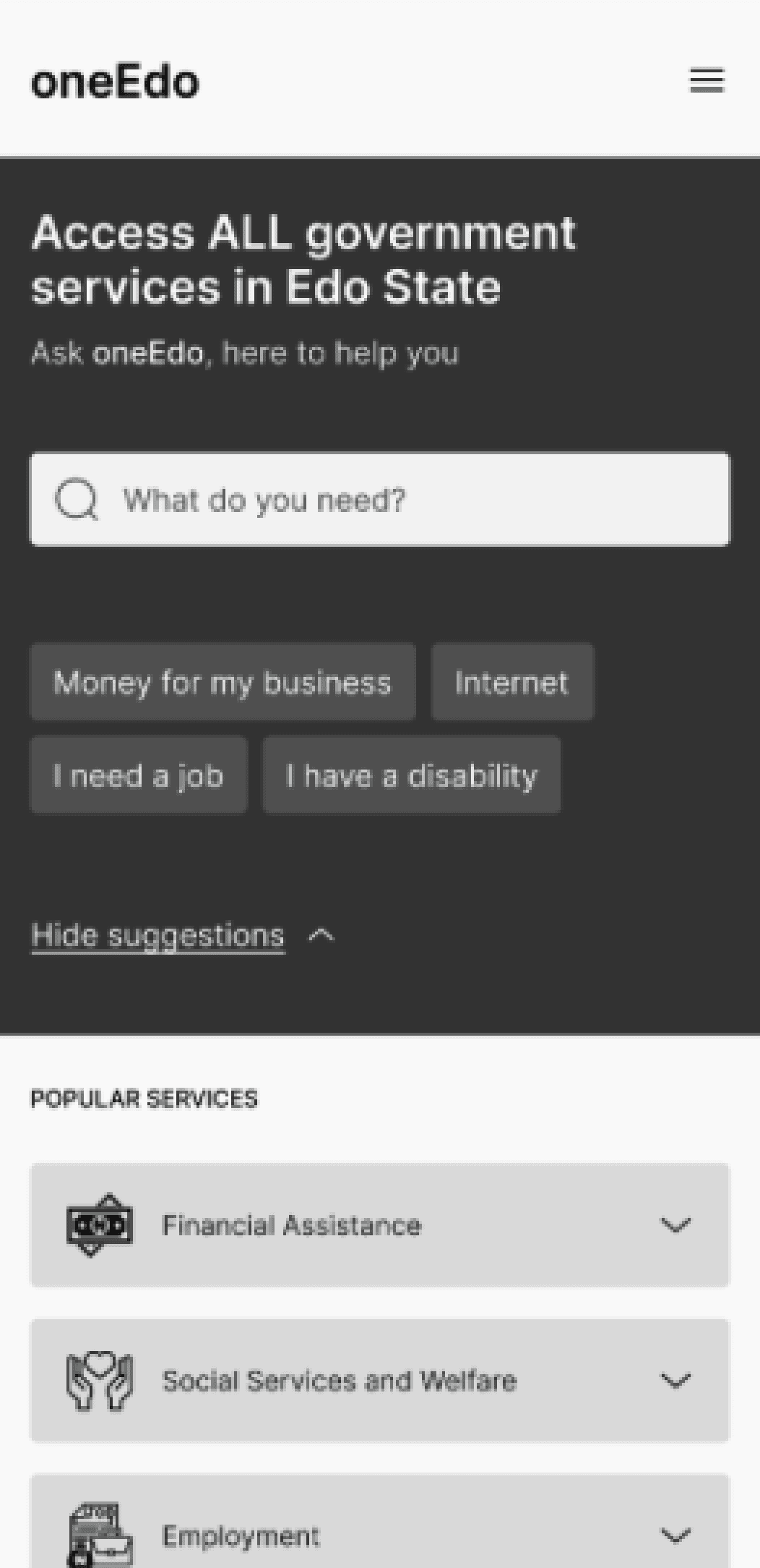
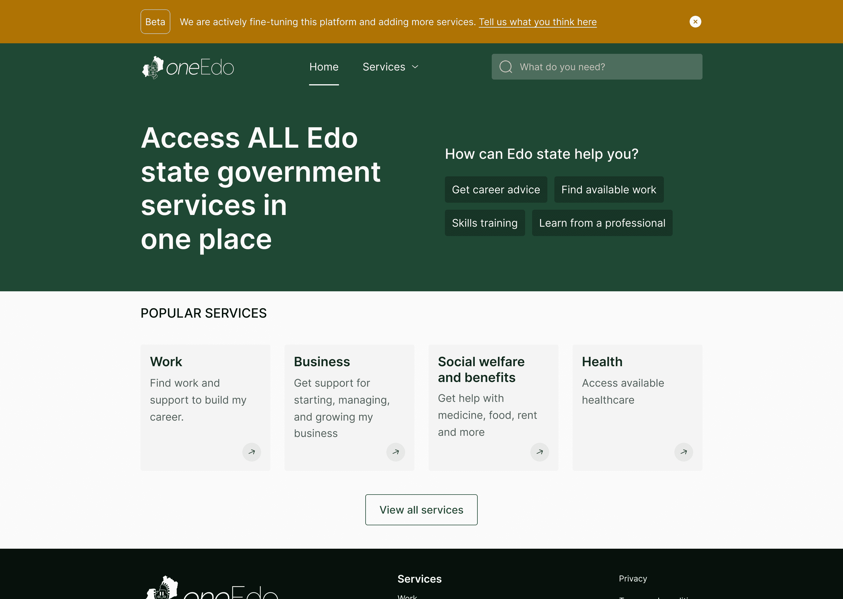
Clear and simple language to introduce users to the platform and guide expectations on what to expect from it
Search bar for free input and quick access to information - with the diverse literacy levels, this might serve as a way to help thin out that barrier that users might otherwise experience when trying to access services on the platform
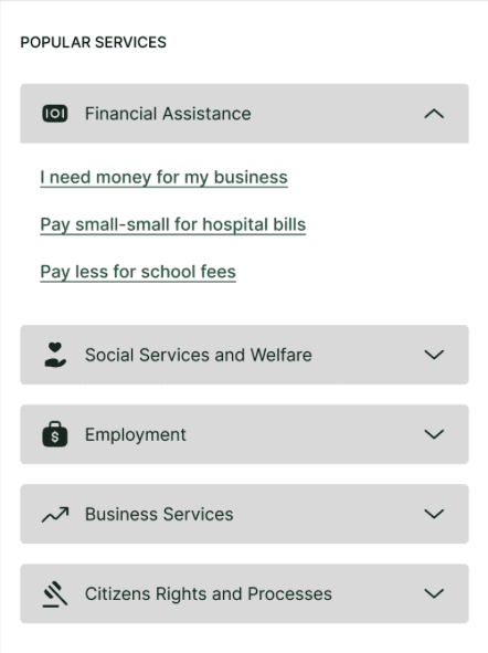
Suggestion for quick access as well and highlighting services that our research showed that users mostly interact with. This section could be expanded to reveal more suggestions to guide the user through the platform but the default is collapsed, taking up less screen real estate
No images and distracting elements that would increase the platform size, affecting loading time, and no distractions to the user achieving their goal
High level popular service categories for quick access and suggestions under each category for quick action
Icons for relatability and easy identification - this would also help with the literacy level and help in situations where users might not quite understand the language but will have some familiarity with the icons
After creating the initial wireframe, we handed over to the research team to test and get feedback, and the results are quite interesting
Testing #1
The lo-fi prototype was tested with real users in a moderated guerrilla testing, with a focus on individuals with low to medium literacy. We also tested the icons with users to see where it could be adjusted and if it would ultimately do more harm than good. Here’s what we learned:
100%
of testers preferred to use the suggestions rather than search
44%
of testers understood the content but appreciated much simpler grammar
55%
of testers could not understand the icons and needed help reading the content
10%
of testers were not interested in participating due to the lack of trust with the government
Following the feedback from testing, we explored a few more options and got feedback from users
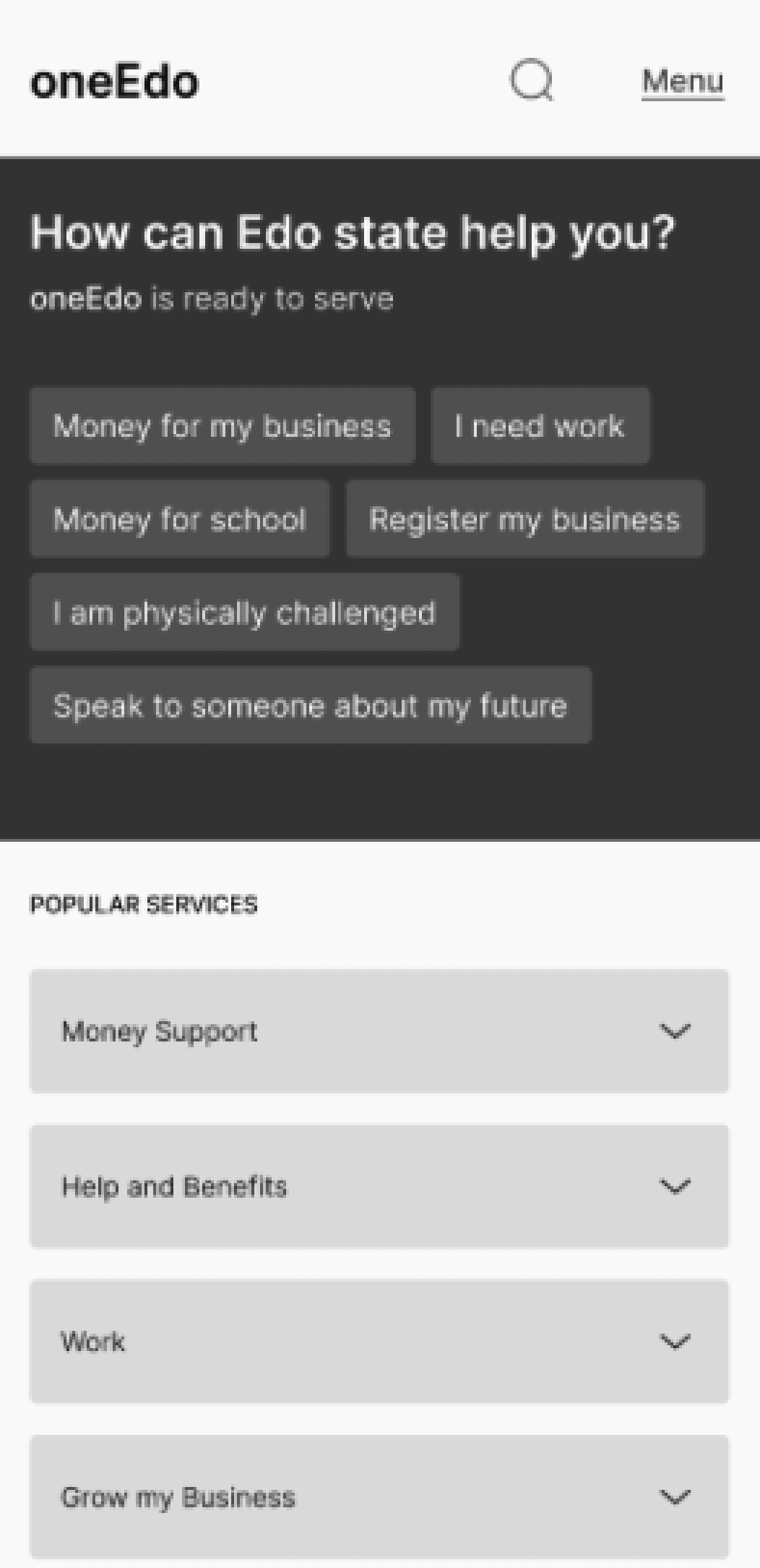
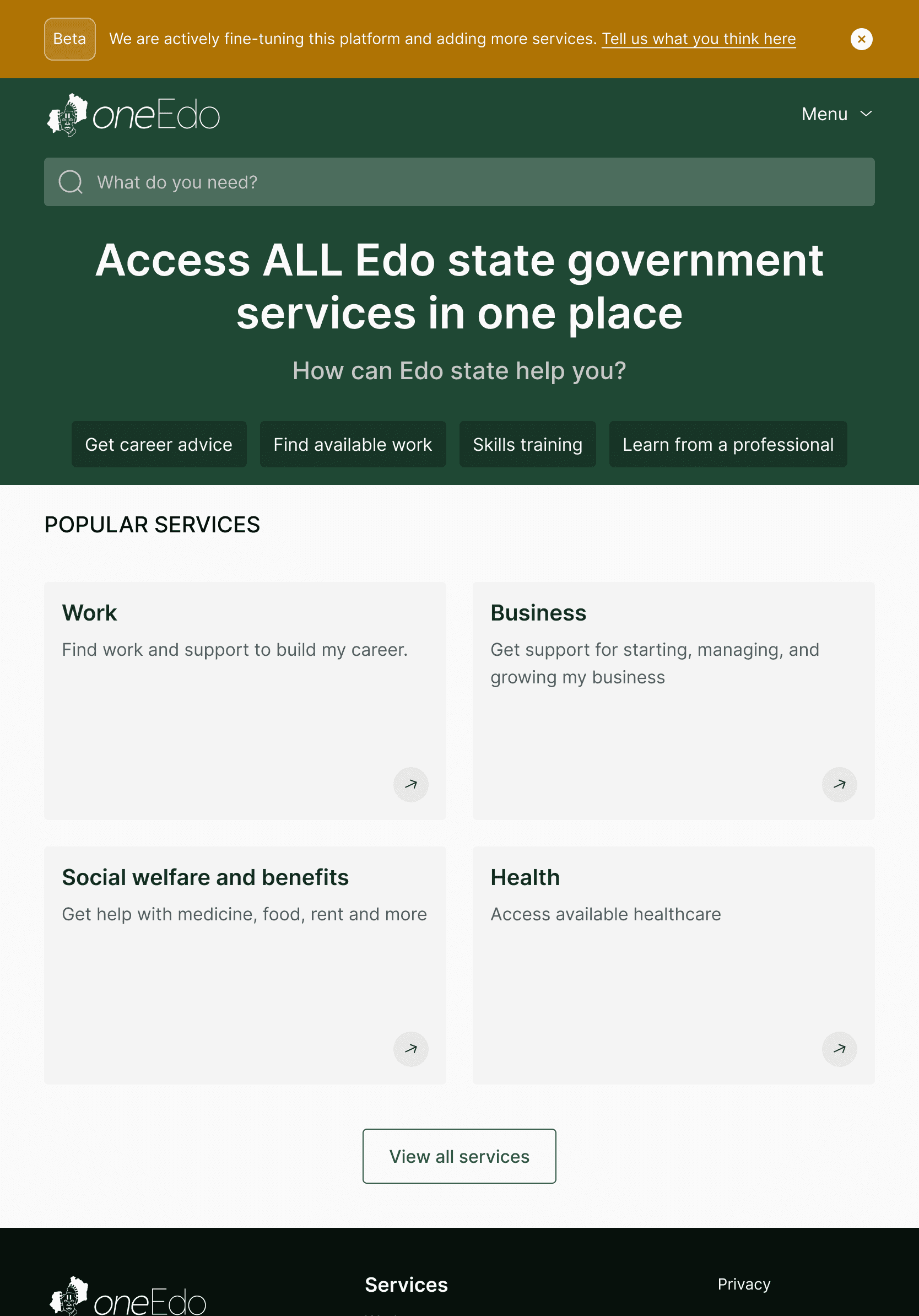
With the first screen, we redesigned the initial wireframe presented to users, updating the icons (a bit more on the nose)
With the second screen, we took out iconography completely and replaced with clear and simple language and we also de-emphasized the search bar and created more room for suggestions.
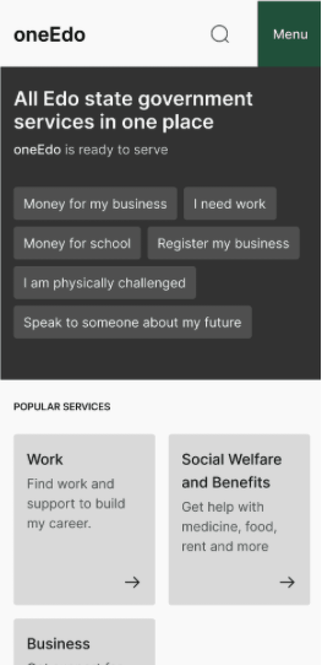
The third screen also has the search bar de-emphasized with more space for suggestions, and the popular services have brief descriptions as alternatives to icons to give more context to the information expected.
Here’s what we got from users:
”Access all government services in Edo state” was the preferred hero copy by most users and a few users liked the engaging nature of “How can Edo state help you?”
Users preferred the popular services layout with the third screen, displaying the name of the service category and an accompanying brief description
Most users did not notice the search icon on the second and third home screen tested
With these insights, we went back to the design and made some changes. Be back with that soon!
Information Architecture
While the initial discovery, prototyping and testing was going on, we also had interactive workshops with the MDAs. From the discovery done, we were able to extract what the key services users needed were and engage with the necessary MDAs to ensure we got accurate and critical information and manage relationships with their different offices.
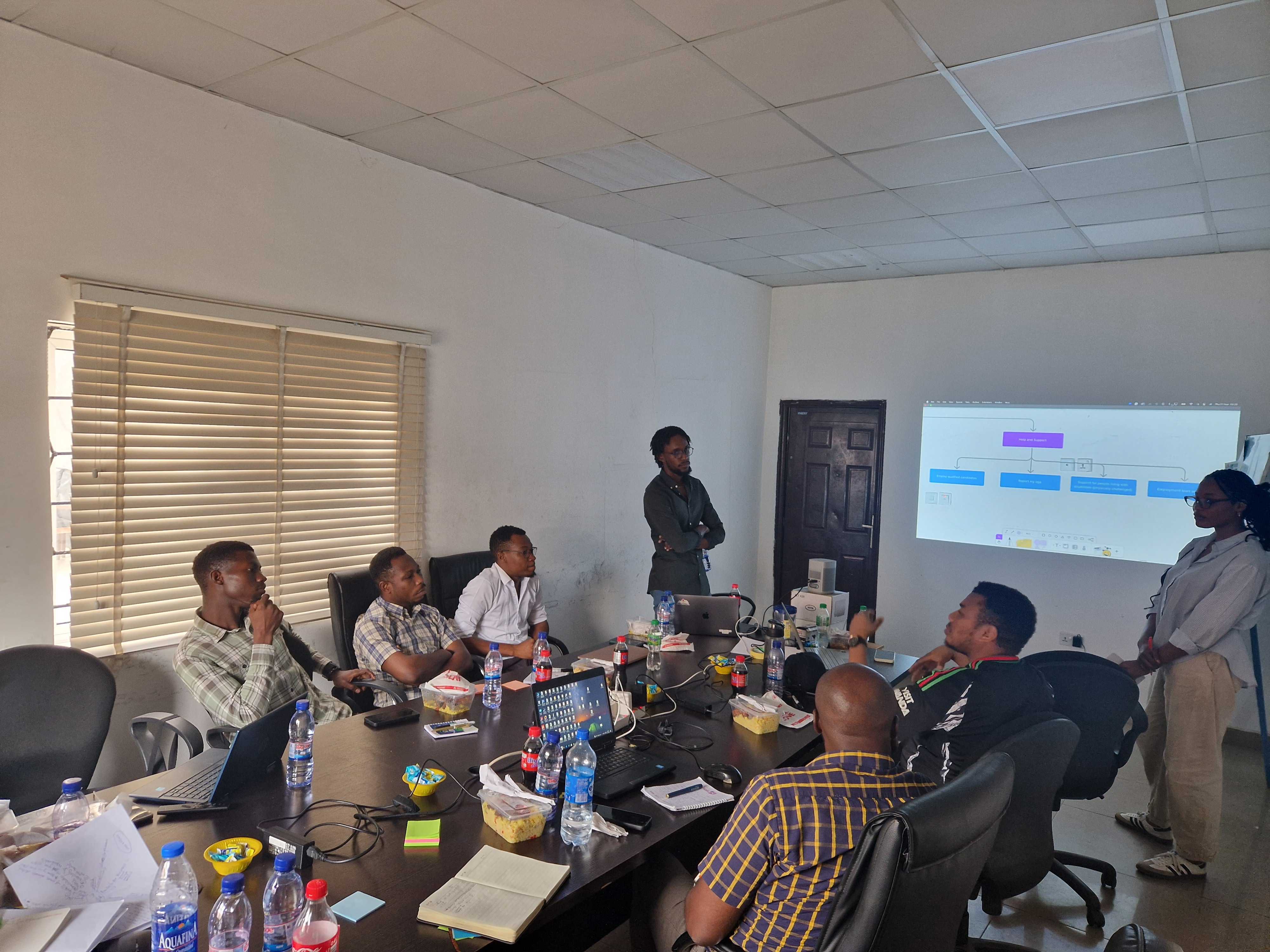
This information would be the bedrock of the platform; the content - it was not only important that we had it but that it was structured and architected well enough for users to access. With this, the information architecture for of the platform was designed.
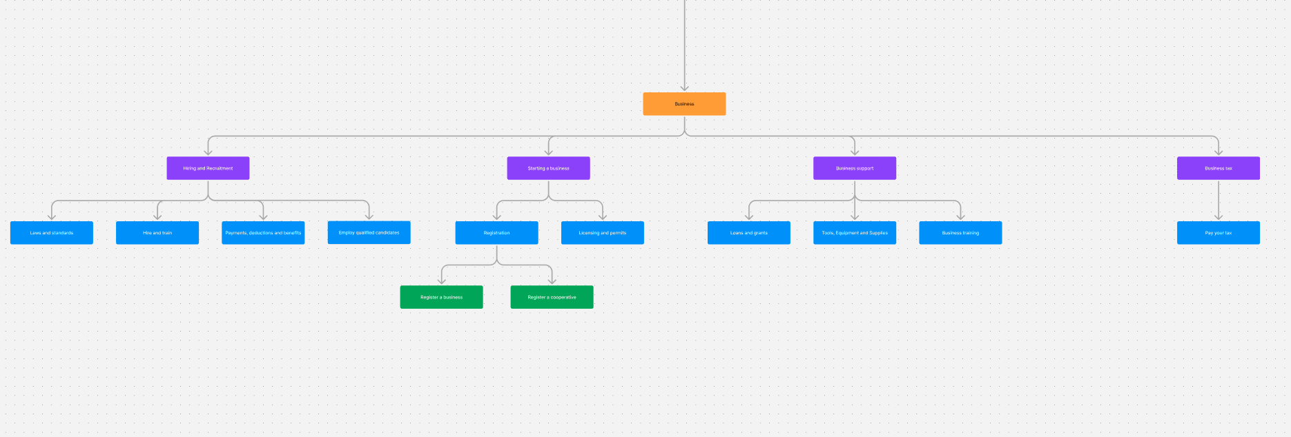
In building out the IA, we had to account for a number of things:
Information often exists in more than one service category
The true path of every content page had to be identified for its corresponding breadcrumb
Language needed to be simple enough for users to understand and broad enough to house lower tiers
The more information we got in constant collaboration with MDAs, the more the IA evolved and changed.
This is a live artefact in the design process and was treated as such throughout the project, constantly being iterated on and evolving.
Design
To kick off the design, we set up the design environment - creating a library and set of rules to guide the design. This was important to keep the design consistent and enable an efficient workflow.
PRIMARY
ALERT
ERROR
NEUTRAL
For the typography, we went for something simple, easy to read, and easily accessible on most browsers
Inter
Inter
With the insights from both the users and the MDAs, and time slowly creeping up on us, we began to iterate on what the final version of the interface would look like, following the guiding principles highlighted earlier:
Accessible
How easy it is for residents to access the platform across different literacy levels and internet connectivity.
Simple
How easy it is for users to navigate and understand the information on the platform.
Task Oriented
Clear and exact designs, ensuring users complete tasks as quickly as possible without any distractions.
Consistent
Ensuring elements used in the design were consistent across all pages to build trust.
The interface had 4 key screens and we created templates for each of them, each with their own page layout:
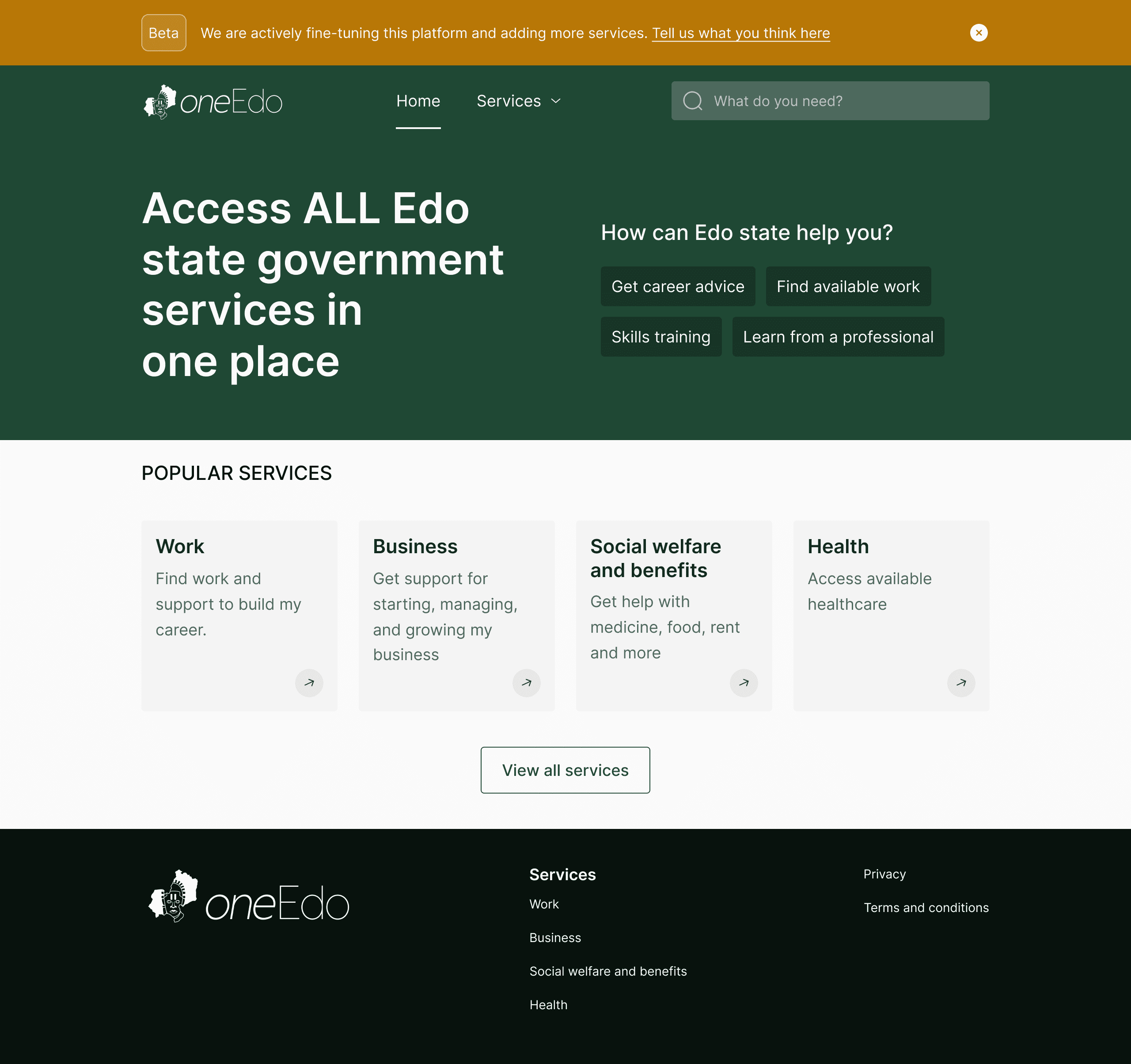
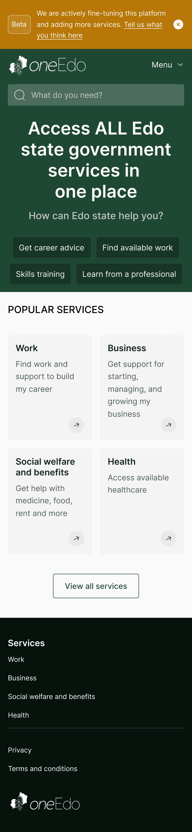
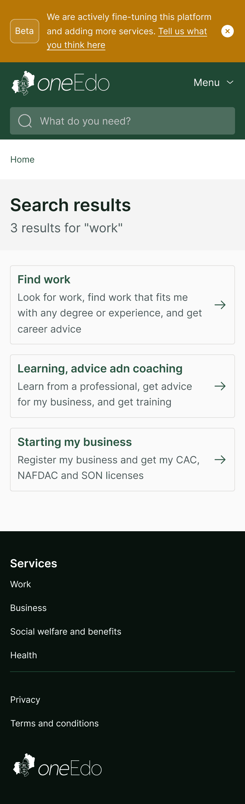
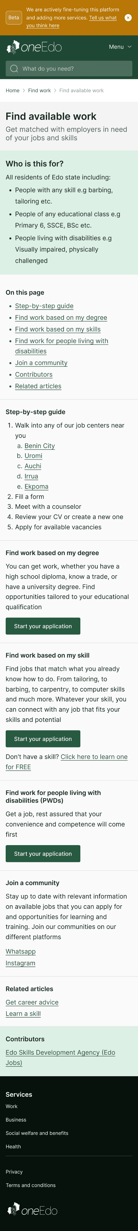
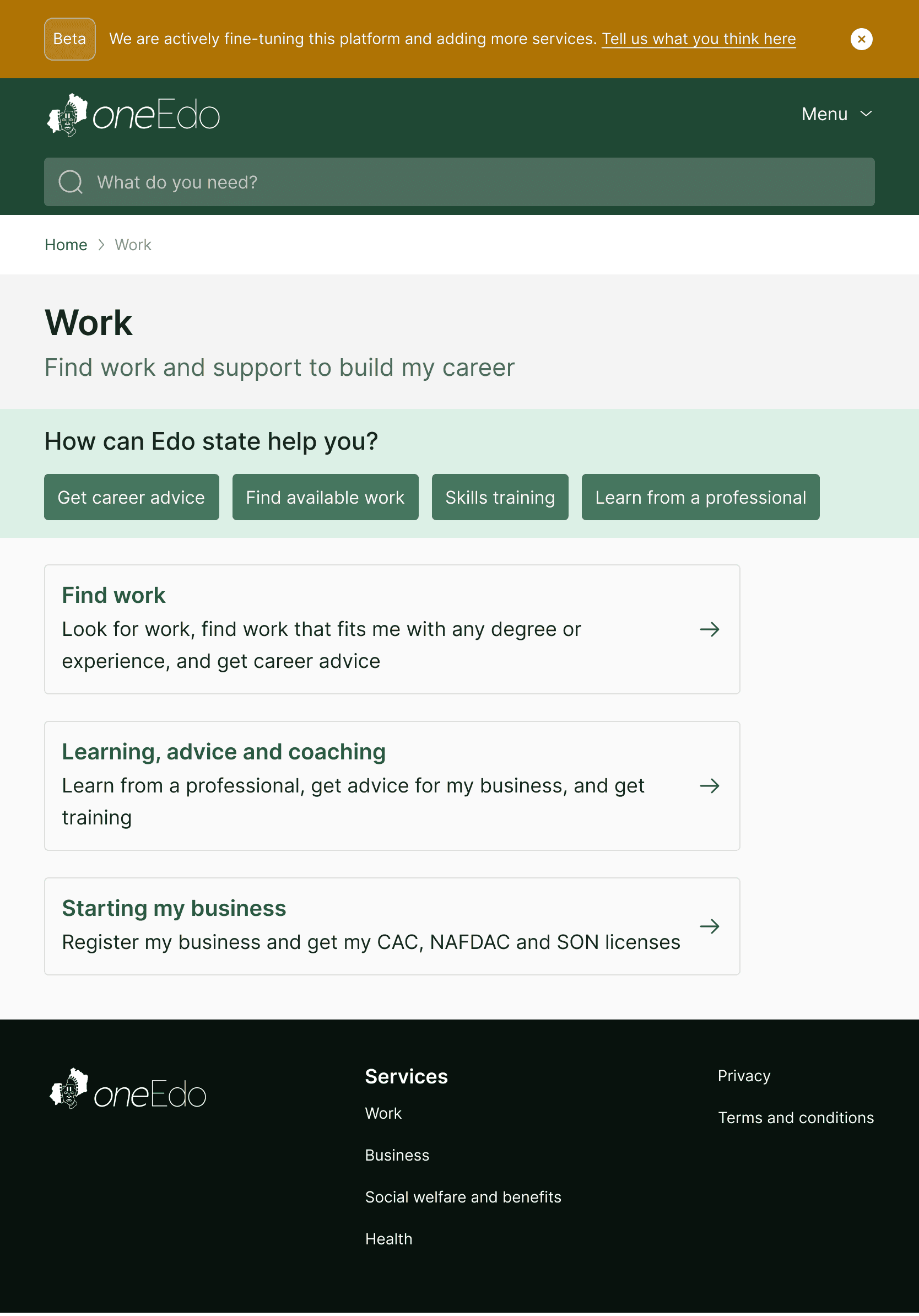
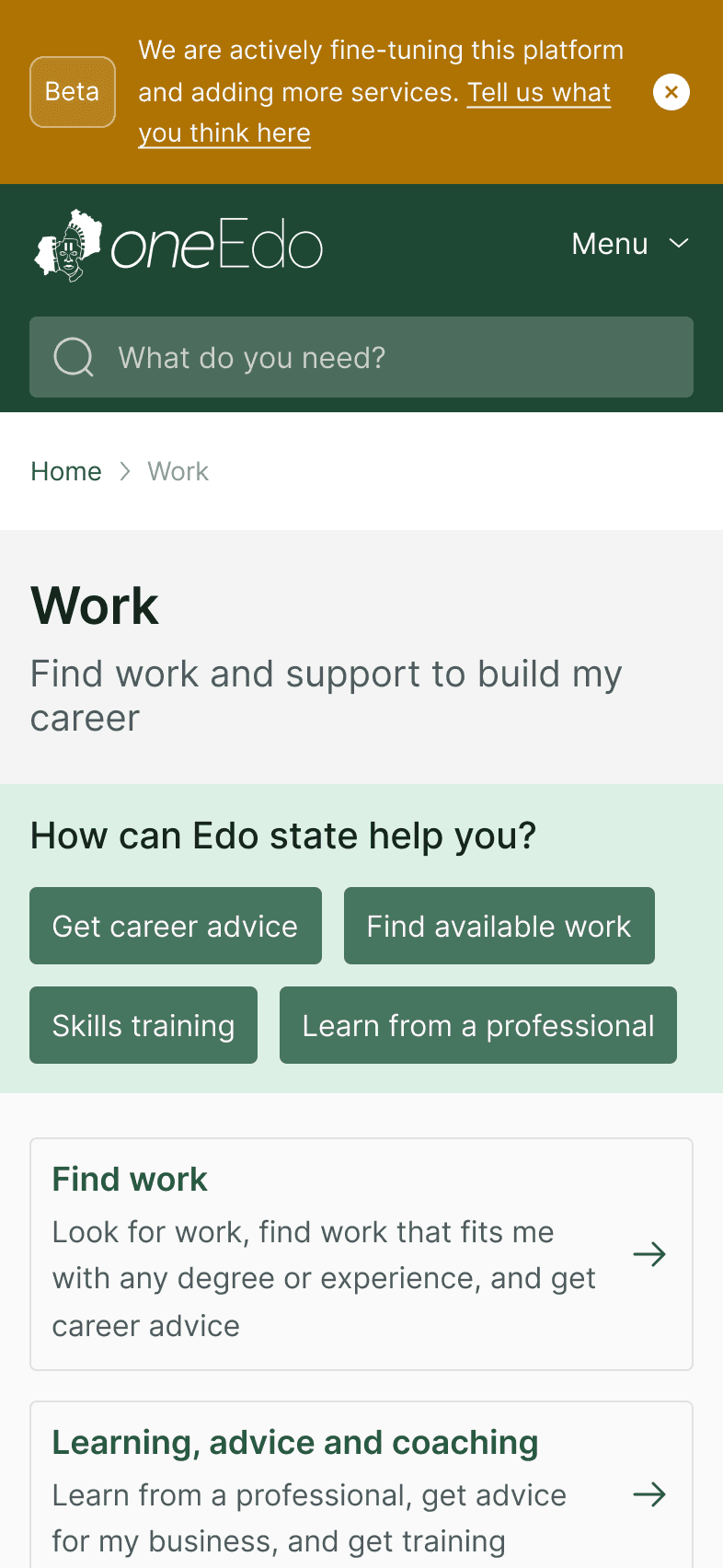
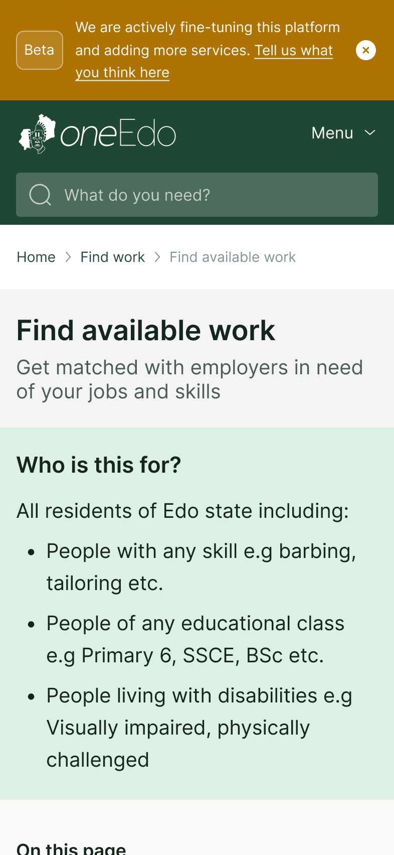
Home Page
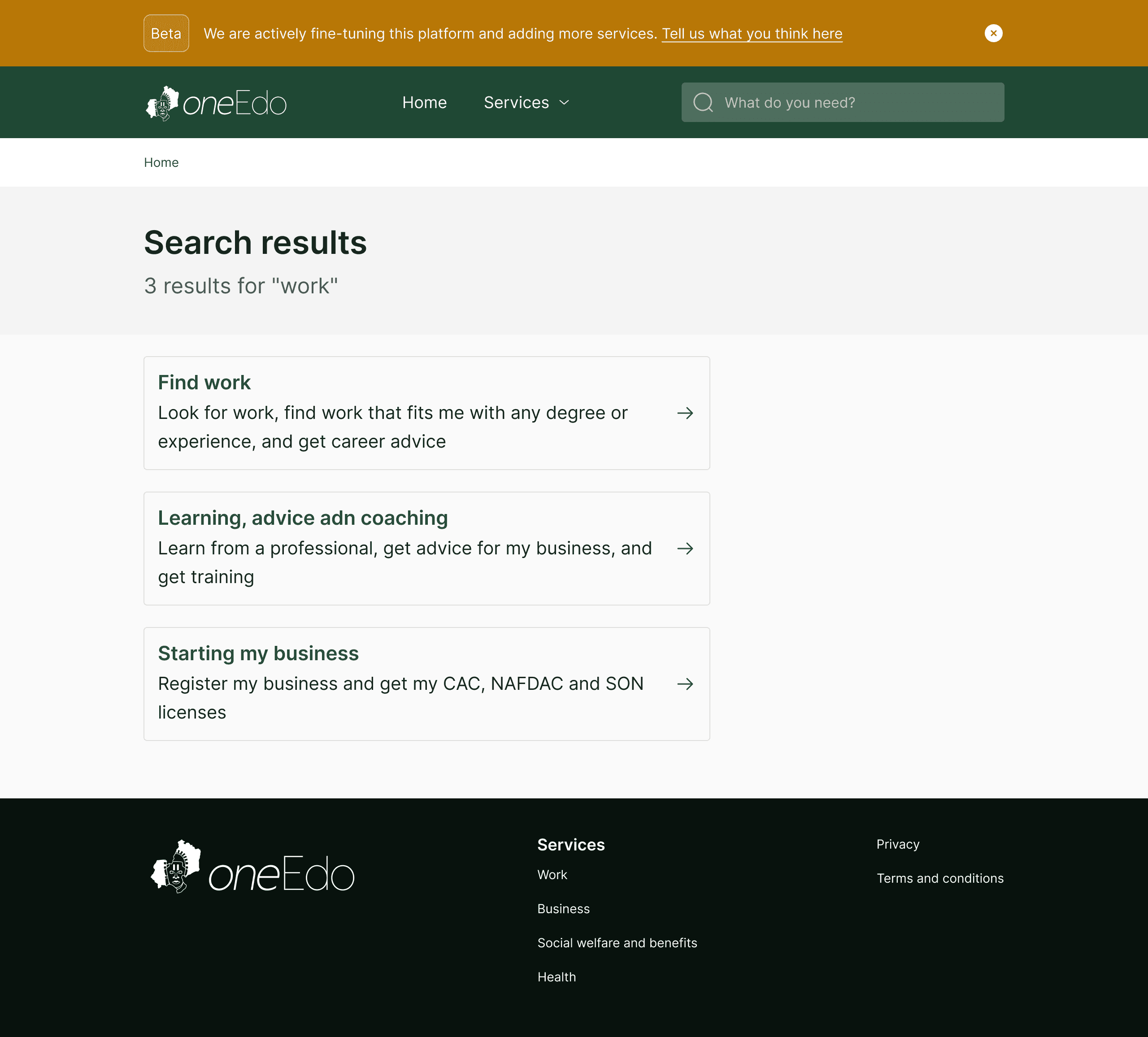
Search page
Service Page
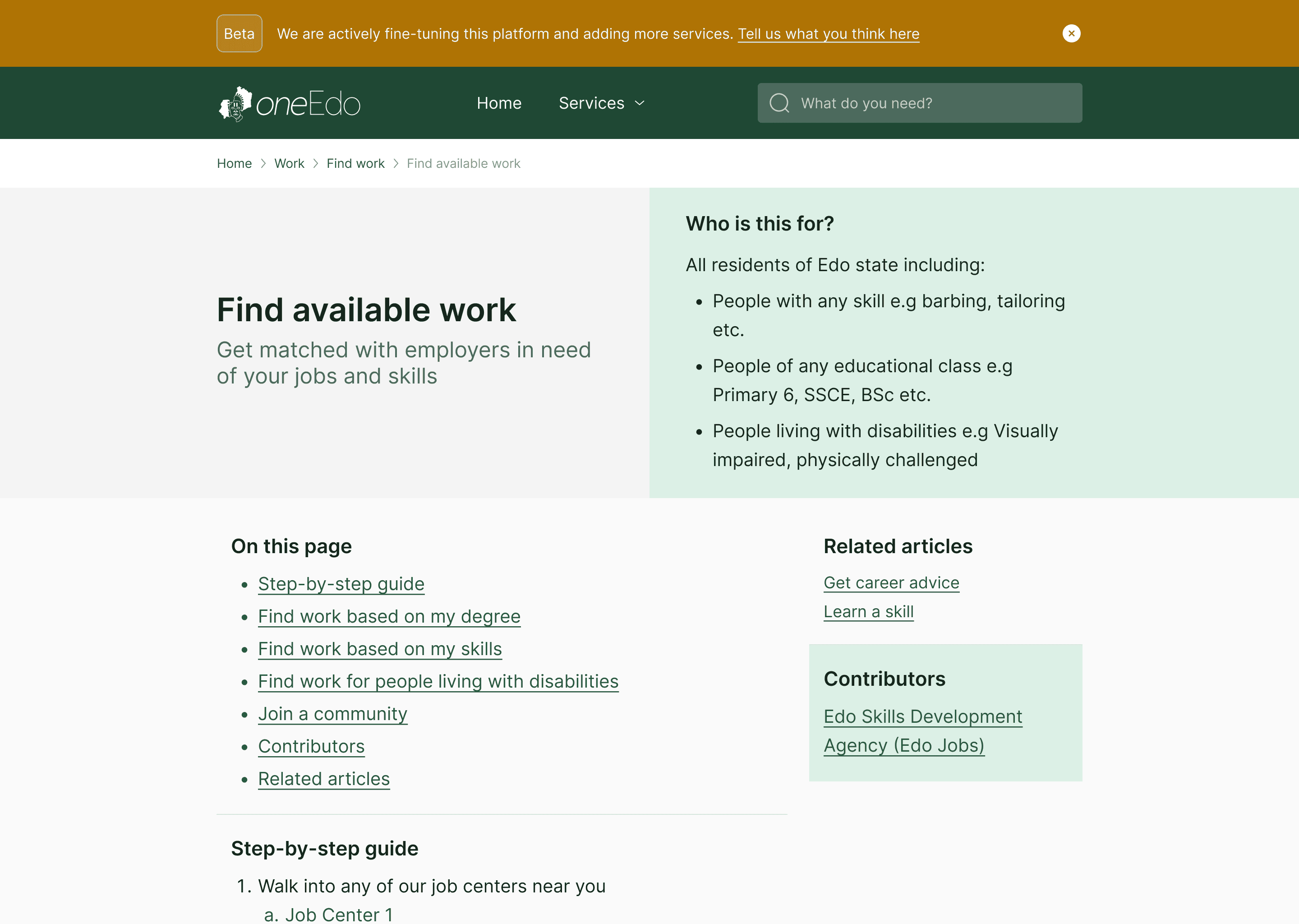
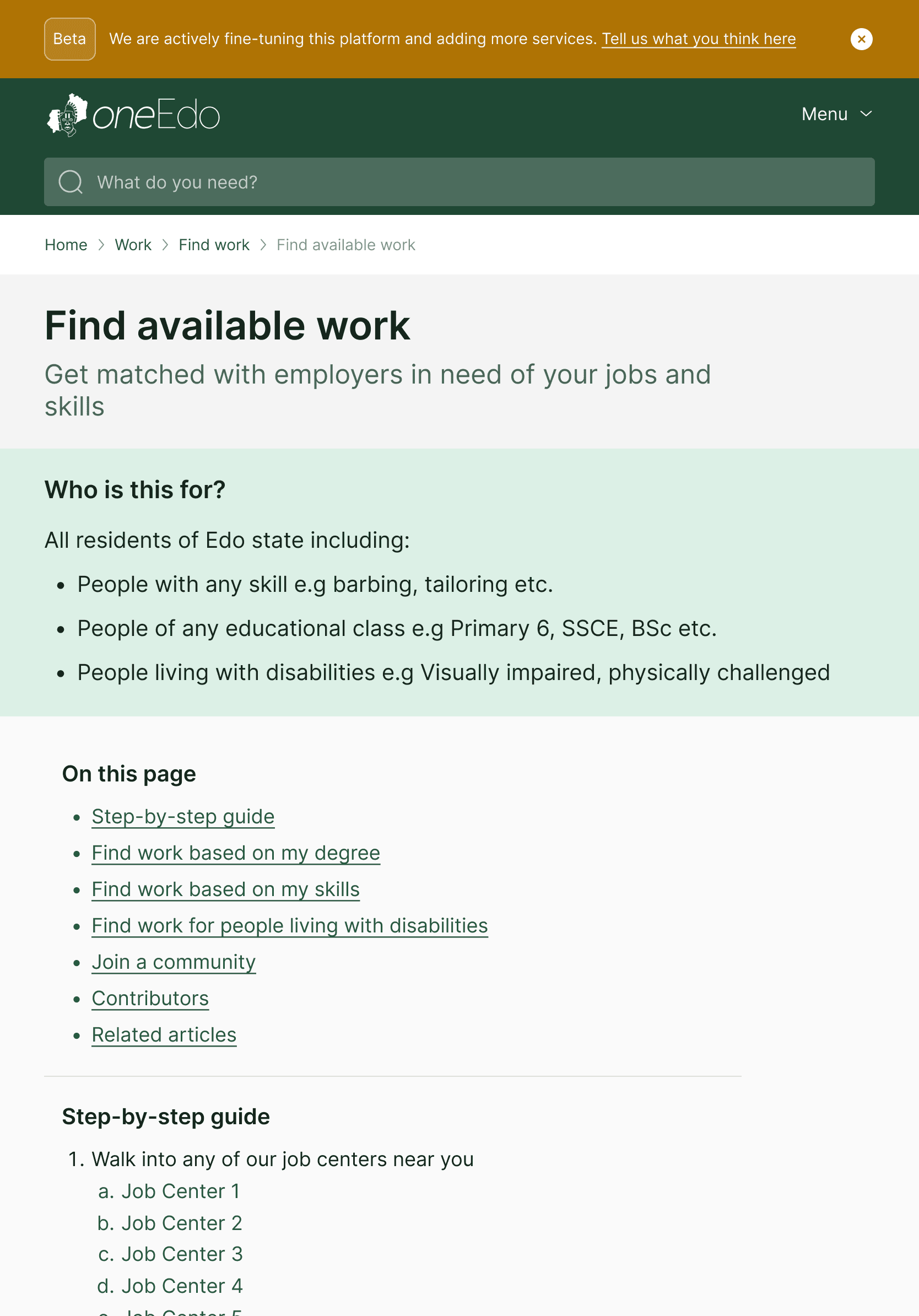
Content Page

Home Page
It was important that the home page not only properly articulated what the site was about, but that it made it easy for users to access the information they would need as quickly as possible.
Search Page
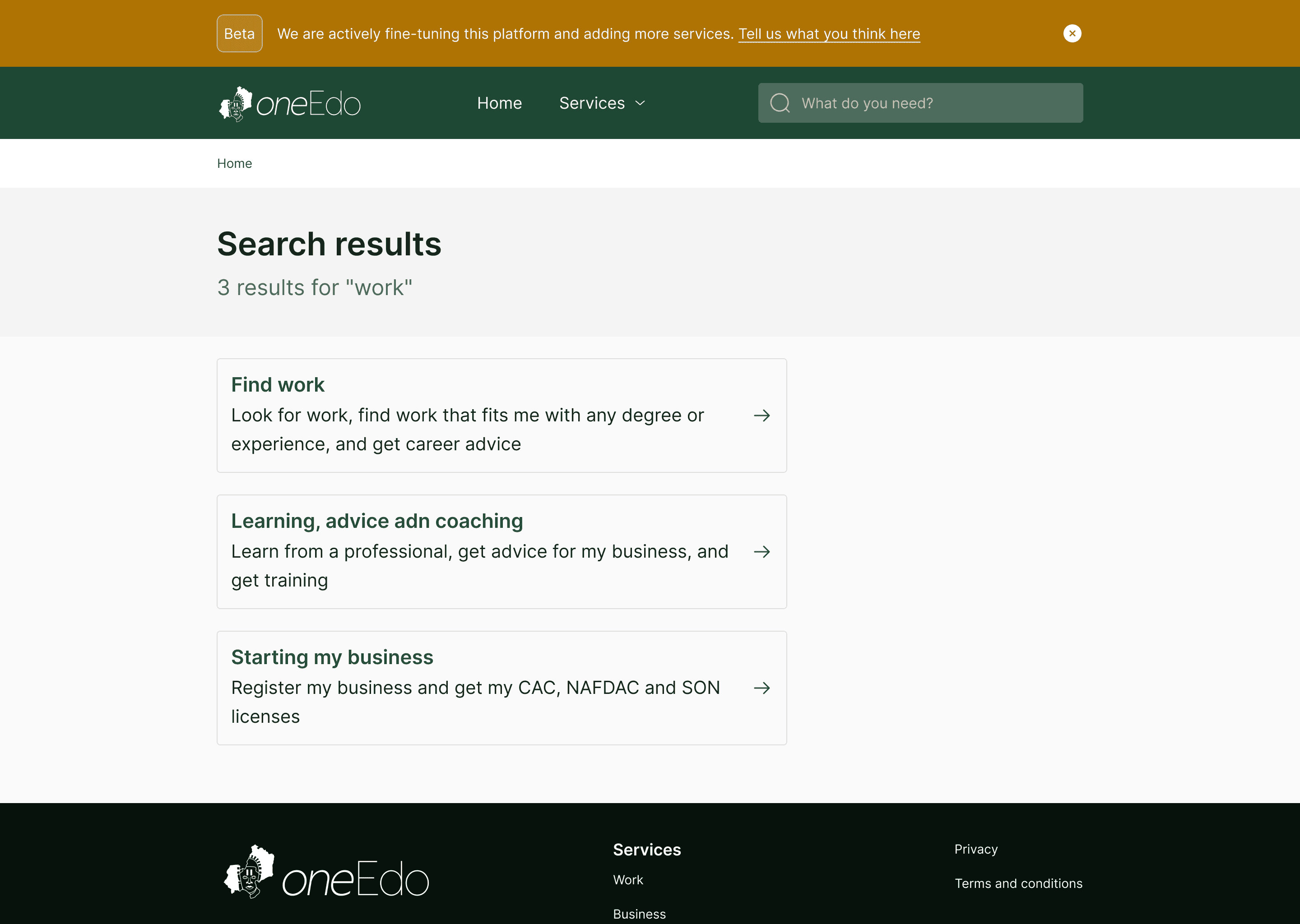
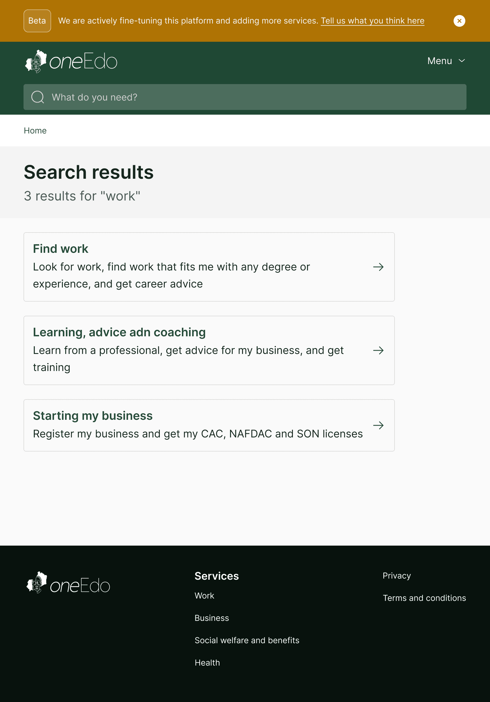
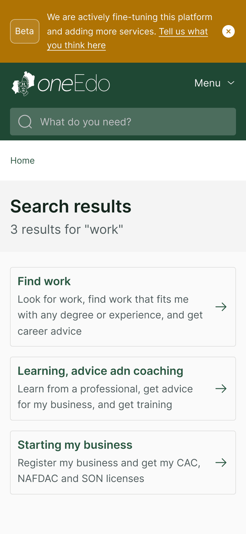
In the event that users opt to search for information as opposed to using the suggestions they need to be quickly guided to necessary content fitting to their search. Each page can be tracked back to its parent service through the breadcrumbs
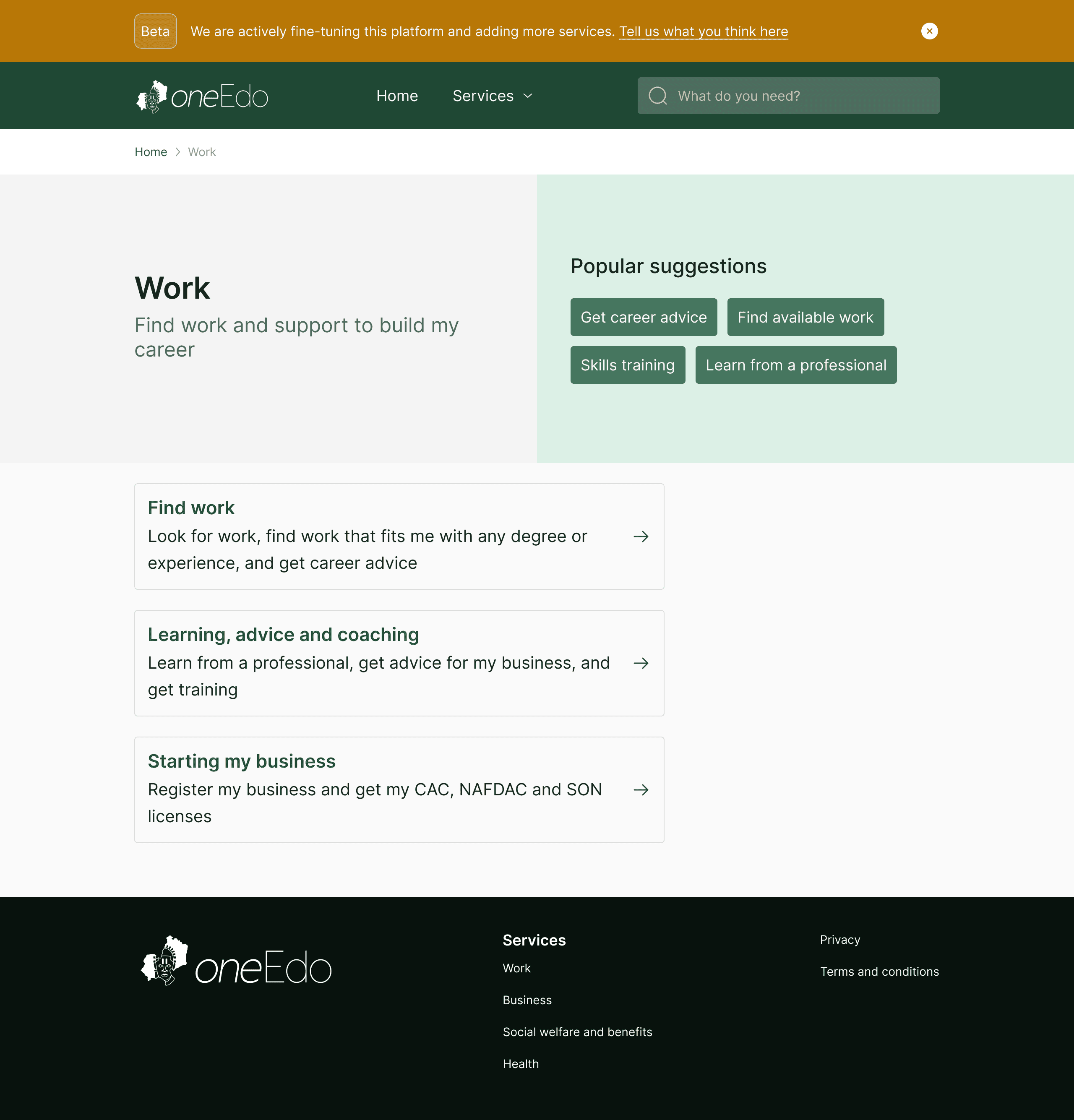
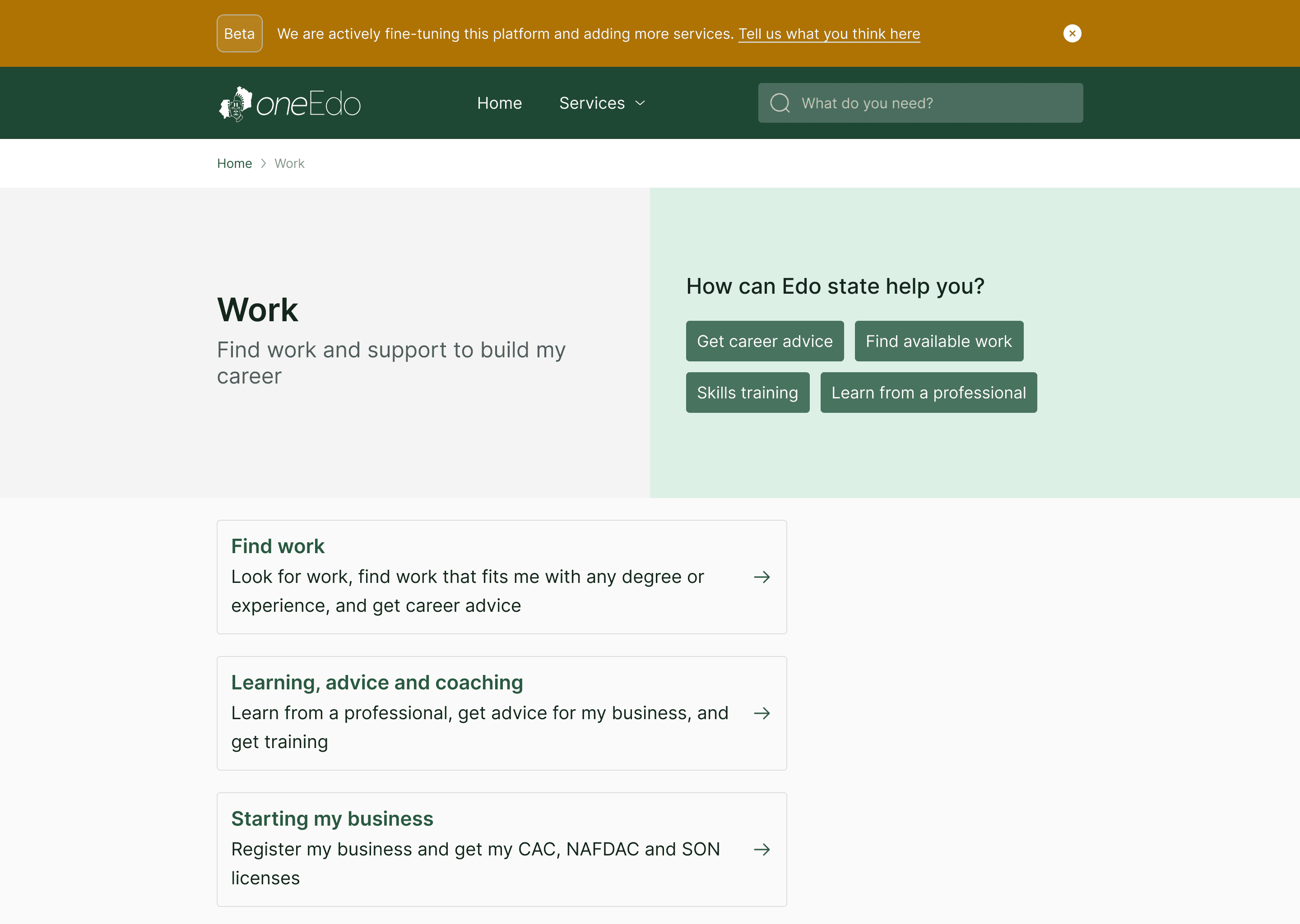
Service Page
Services and their embedded content needed to be clear to ensure users can make informed decisions going into the next phase of their journey. Suggestions also allowed for quick access to information where otherwise longer journeys might have been involved
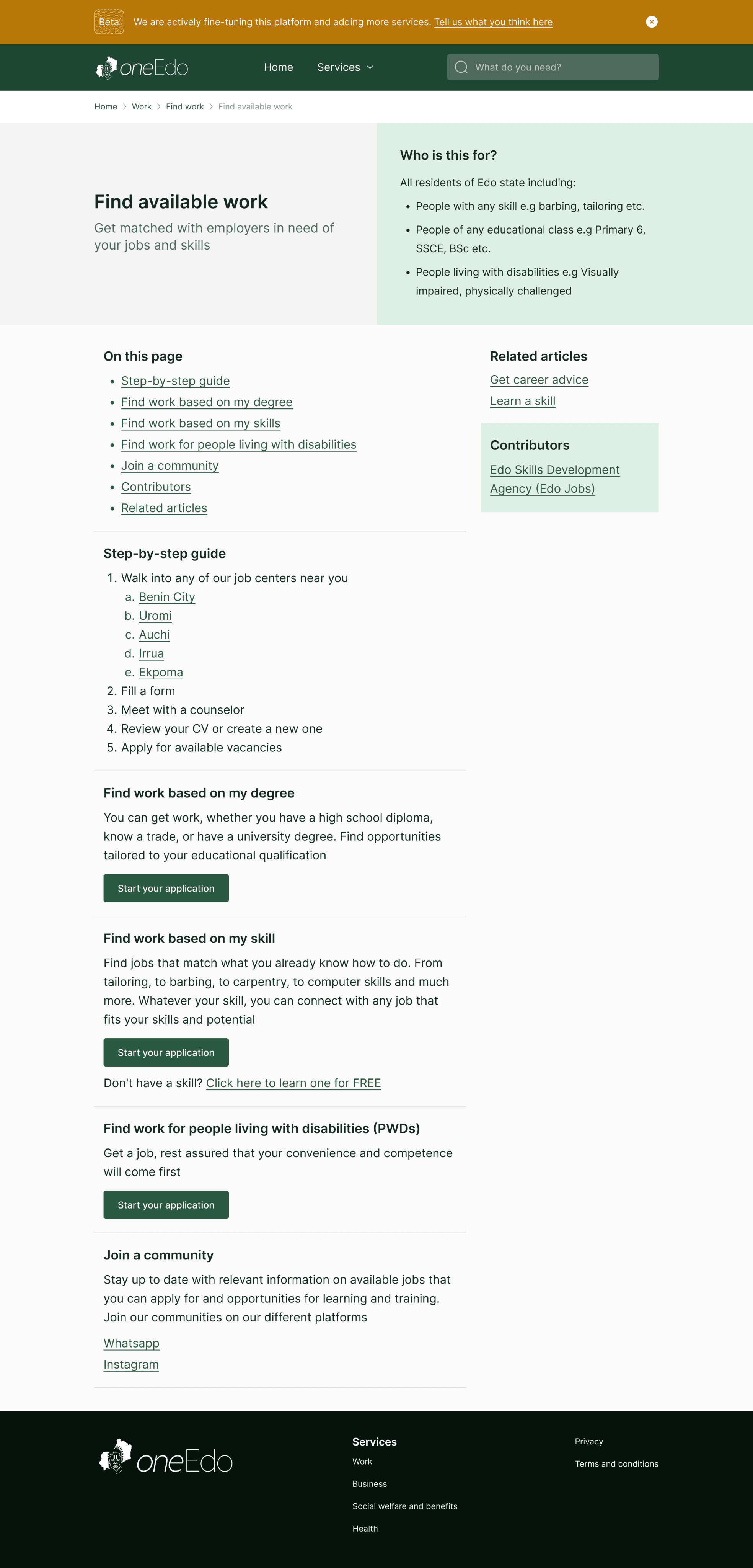
Content Page
From above the fold it was important that users are aware what information they are getting and the value of that information to the individual user - who is this for. A page guide helps for quick navigation and deep links in the content help for wide and varied navigation across the contents of the platform.
Testing and Feedback
Following the implementation of the designs by the engineering team, we tested the platform with users and recorded the results using Hotjar
In the first 24 hours of testing we recorded:
50
sessions with an average duration of 4m 55s
6.9
pages per session, showing strong user engagement
28%
bounce rate; most users continued exploring beyond the landing page
>1s
load time with users in rural areas who experience low internet connectivity
What users liked:
Ease of use
The platform is highly praised for being user-friendly and easy to navigate.
Speed
The website loads quickly, providing a smooth experience.
Content
Users found the information valuable, particularly regarding career opportunities and advice
What could be better?
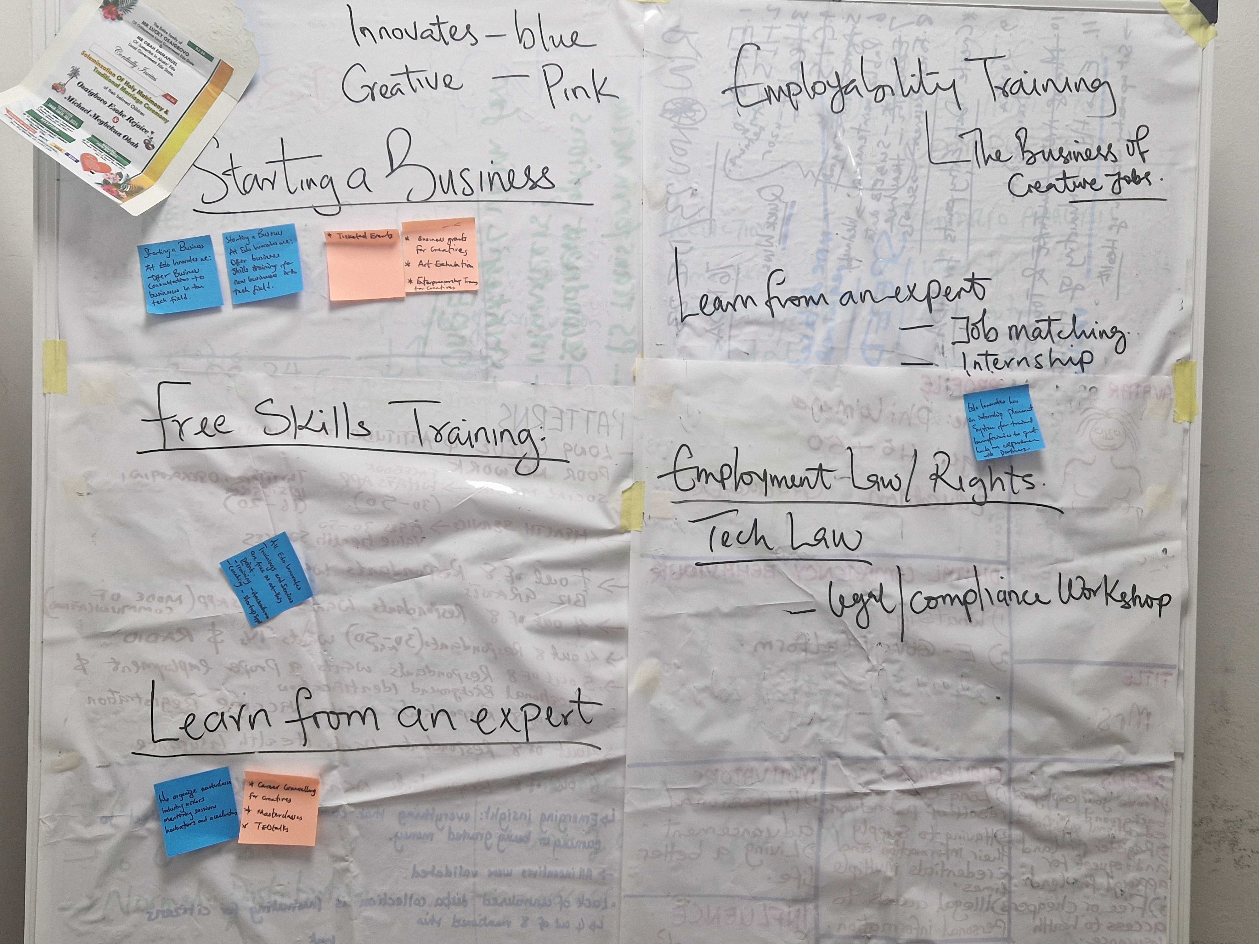
More features
Users requested a broader selection of services, such as customer care chatbots, account creation, and more resources.
Functionality
Suggestions for adding features like FAQ pages, online payment systems, and access to official documents.
Service variety
There is a demand for more job listings, direct links to job sites, and more comprehensive options for services (e.g., insurance companies, court processes).
Next Steps
Following the completion of this project, we trained and equipped the government officials to carry on with the project and charged them with the responsibility of managing the platform and onboarding more services. We had a small team of officials actively involved in the process from the beginning, enabling them to be in a great position to scale the skills learnt and knowledge acquired to other team members and the department at large.
Moving forward, these are the next steps outlined:
Refine user insights and analytics - collect actionable insights to inform future platform iterations
Expand services to additional categories - broaden the scope of the platform to include more service categories
Encourage MDAs to optimise their digital service delivery based on feedback from residents and businesses
LET’S WORK TOGETHER
Have a project, collaboration, or idea in mind? I’d love to hear from you.